
What Makes a Website Easy to Use? Looking at UX Through Two Websites
Every time we visit a website, we already have expectations about how it should work. We expect a search bar to let us search, a button to take us somewhere, and a menu to show us additional options. When a website follows those expectations, we usually don’t think about the design at all. When it doesn’t, even simple tasks can become confusing.
This is where concepts like affordances, signifiers, mapping, and feedback become important. Don Norman’s The Design of Everyday Things explains how good design helps users understand what actions are possible and what will happen when they interact with something. In web design, these ideas can make the difference between an interface that feels natural and one that makes users stop and figure out what to do.
For this assignment, I looked at two websites that I don’t normally use: the National Park Service and The Metropolitan Museum of Art. I explored both sites to see how they communicate with users and how their design affects navigation.
Understanding Affordances and Signifiers
An affordance is what an interface element allows a user to do. For example, a search field affords typing, while a button affords clicking.
A signifier is what communicates that an action is possible. A search icon tells us where to search, while a button’s shape and label can tell us that it can be clicked.
These concepts are closely related. A search bar may afford typing, but its label, placement, and magnifying glass icon help signify that it is a search function. Familiar design patterns allow users to rely on previous experiences and mental models instead of having to learn every website from scratch.
The National Park Service
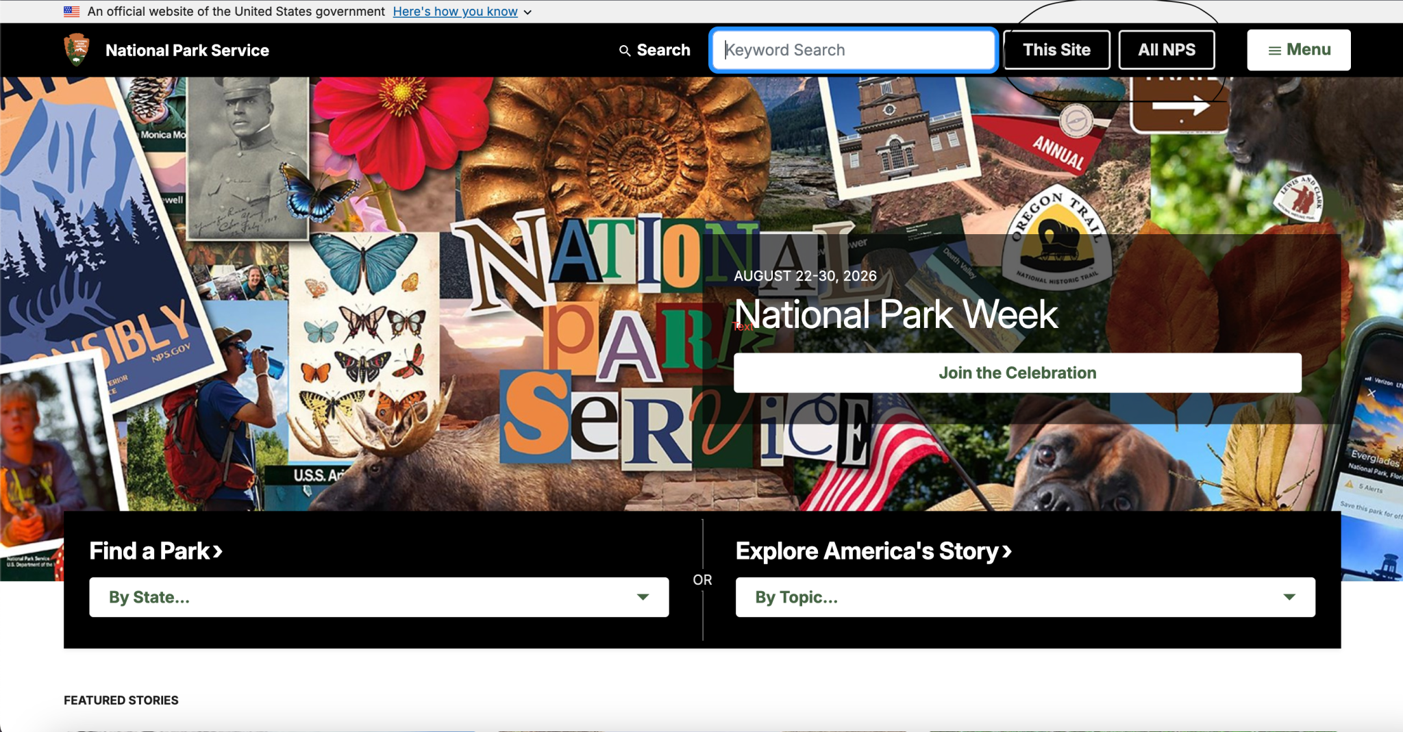
The National Park Service website was the first site I evaluated. Since the NPS contains a huge amount of information about parks, history, nature, activities, and visiting, I was interested in how the site would organize all of that information.
One of the strongest affordances on the homepage is the search field. It is positioned prominently near the top of the page and immediately gives users a way to find information without having to navigate through the entire site. I found it easy to locate and use, and its placement matched my expectation that a large informational website would have an obvious search function.
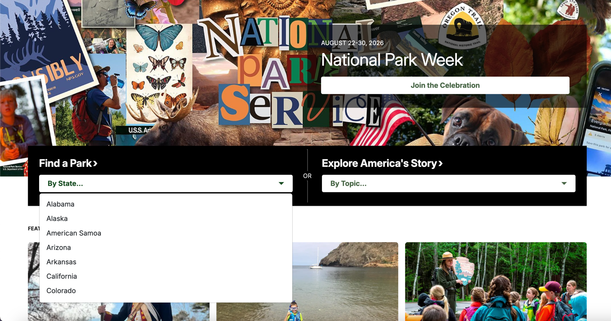
Another useful affordance is Find a Park. The site allows users to browse parks by state, which provides a simple geographic way to find information. I found this fairly easy to understand because I could scroll through the states until I found the one I was looking for.
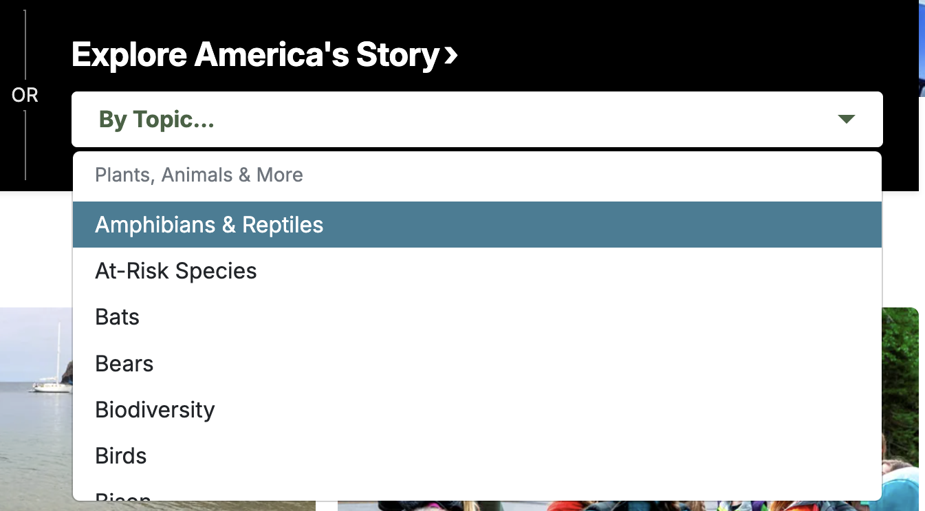
The NPS also provides an Explore America’s Story section. This was interesting because it gives users a different way to explore the site. Instead of starting with a particular park, users can explore topics such as animals and plants, forces of nature, and other subjects. This means someone who doesn’t know exactly what they are looking for can still discover information.
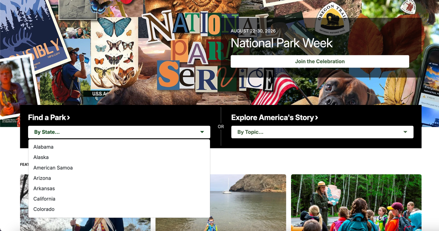
The NPS also uses familiar signifiers. The search icon communicates where users can search, while the hamburger menu indicates that additional navigation options are available. Labels such as “Find a Park” also make the purpose of different sections clear without requiring much explanation.
The site’s mapping was generally logical as well. Selecting a state and then finding parks in that location follows the user’s natural expectation:
Select a state → Find parks in that state.
The same principle applies to searching:
Enter a keyword → Receive relevant information.
The feedback throughout the site also helped confirm where I was in the website and what information I had accessed. The homepage was particularly easy to explore because many areas of information were presented directly on the page through sections such as Featured Stories.
The biggest issue I noticed was that finding a specific state can require some scrolling. This isn’t a major problem, but a searchable state selector could make the process faster. Instead of manually scanning through the list, users could simply type the state they want.
The Metropolitan Museum of Art
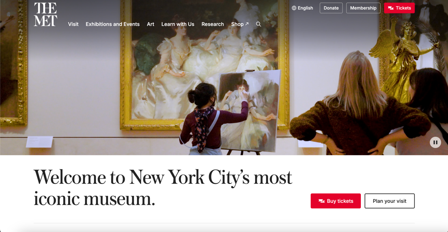
The second website I evaluated was The Metropolitan Museum of Art. Unlike the NPS website, which focuses heavily on finding information and planning visits, The Met has to organize a huge collection of artwork along with exhibitions, events, research, education, and visitor information.
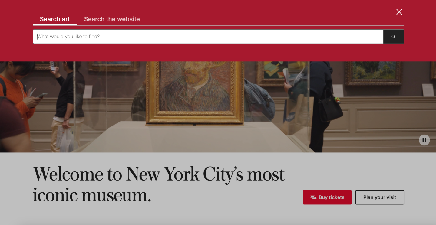
The Met’s search function is one of its most useful affordances. The magnifying glass makes its purpose recognizable, while the search function gives users a direct way to find information about the museum and its collection.
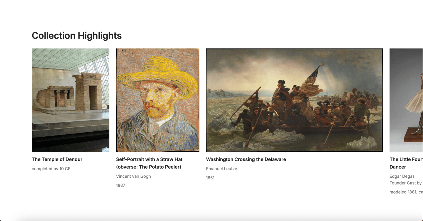
The Collection section is another strong affordance. Users can browse individual works of art and explore the museum’s collection visually. This makes sense for the type of website because images themselves become an important part of the navigation experience.
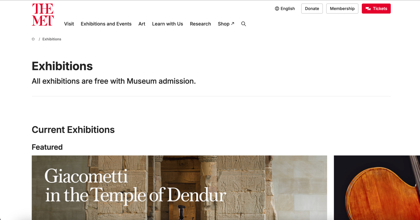
The Exhibitions section provides another clear path through the website. Users can browse exhibitions and then select an individual exhibition to find more information about it. This creates a straightforward progression from a general category to specific content.

The Met also makes extensive use of signifiers. Navigation labels such as Visit, Exhibitions and Events, Art, Learn, Research, and Shop tell users what they can expect to find in each section. Visitor-related controls also make actions such as planning a visit or finding ticket information recognizable.
The mapping on The Met’s website generally follows a logical hierarchy:
Art → Collection → Individual artwork
and:
Visit → Plan Your Visit → Tickets / Hours / Directions
These relationships match the mental models most users would probably have when visiting a museum website. Someone looking for an artwork would expect to start with the art or collection section, while someone planning a physical visit would expect information about tickets, hours, and directions to be grouped together.
One potential issue is the sheer amount of information available. The Met has to serve many different audiences, and its website reflects that. For a first-time user, having so many categories can create some cognitive load because there are many possible directions to go.
One possible improvement would be to make the most common goals more prominent, such as Visit the Museum, Buy Tickets, Explore Artwork, Find an Exhibition, and Find Directions. This could give first-time visitors a more direct starting point.
Comparing the Two
Although the NPS and Met websites serve very different purposes, both rely on many of the same UX principles.
The NPS website felt slightly more approachable to me because its main discovery options were presented directly on the homepage. Search, finding a park, and exploring topics were all relatively easy to locate.
The Met uses a more traditional category-based structure, separating areas such as visiting, exhibitions, art, learning, research, and shopping. This organization makes sense because the museum has so many different types of content and users.
Both websites used familiar signifiers and generally logical mapping. However, the biggest difference I noticed was how each site approached discovery. The NPS website encourages users to explore through several different paths, while The Met relies more heavily on its category structure.
Why These Principles Matter
Evaluating these websites made it clear that UX design is about more than making a website look good. A visually appealing website can still be frustrating if users don’t understand what they can click, where an action will take them, or whether something they did actually worked.
Good affordances allow users to understand what actions are possible. Signifiers communicate how those actions can be performed. Mapping connects actions with expected results, and feedback confirms what happened.
These principles are especially important because users bring their own expectations and mental models to a website. Designers don’t get to completely control how people interact with an interface. Instead, they need to create an experience that works with the expectations users already have.
Looking at the National Park Service and The Metropolitan Museum of Art showed me how small interface decisions can have a large effect on usability. When a website clearly communicates what users can do and what will happen next, people can focus on accomplishing their goals instead of trying to figure out how the website works.
Sources
Norman, D. (2013). The Design of Everyday Things: Revised and Expanded. Basic Books.
Weinschenk, S. M. 100 MORE Things Every Designer Needs to Know About People. New Riders.
Leech, J. UX, Psychology and Your Product.
National Park Service. National Park Service. https://www.nps.gov/
The Metropolitan Museum of Art. The Metropolitan Museum of Art. https://www.metmuseum.org/
