
How Websites Make Us Feel: The Three Levels of Processing in Web Design

Introduction: We Judge Websites Before We Use Them
When we visit a website, we start forming an opinion almost immediately. Before we even click a button, we might decide that a website feels professional, exciting, confusing, trustworthy, or easy to use. These reactions are not just about whether a website looks good. They are also connected to how the website works and what we think about the organization behind it.
Don Norman’s Three Levels of Processing provide a useful way to understand these reactions. The three levels are visceral, behavioral, and reflective. Visceral processing focuses on our immediate emotional reaction to a design. Behavioral processing focuses on how well the design works and how easily we can accomplish our goals. Reflective processing focuses on the meaning we take away from the experience and how it affects our longer-term impression of a brand (Komninos, 2020).
To see how these ideas work in practice, I looked at two very different websites: Apple and Airbnb. Apple is focused on technology and product purchasing, while Airbnb is focused on travel, searching, and booking. Even though they have very different purposes, both websites use design to influence how users feel and behave.
1. Visceral: The First Impression
The visceral level is about what we feel when we first see something. In web design, this can come from things like color, typography, imagery, spacing, layout, and branding.
Apple
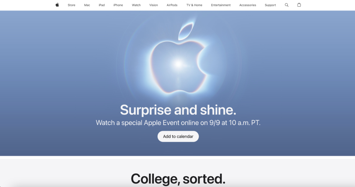
Apple’s website creates a very polished and premium first impression. Large product images immediately draw attention to the products, while generous whitespace keeps the page from feeling cluttered. The typography is clean and minimal, and large headlines establish a clear visual hierarchy.
The photography is also extremely controlled and professional. Instead of overwhelming the user with decoration, Apple allows the products to become the main focus.
The result is a website that feels premium, innovative, minimal, professional, and confident. Even before interacting with the site, users get the impression that Apple’s products are high-quality and desirable.
Airbnb
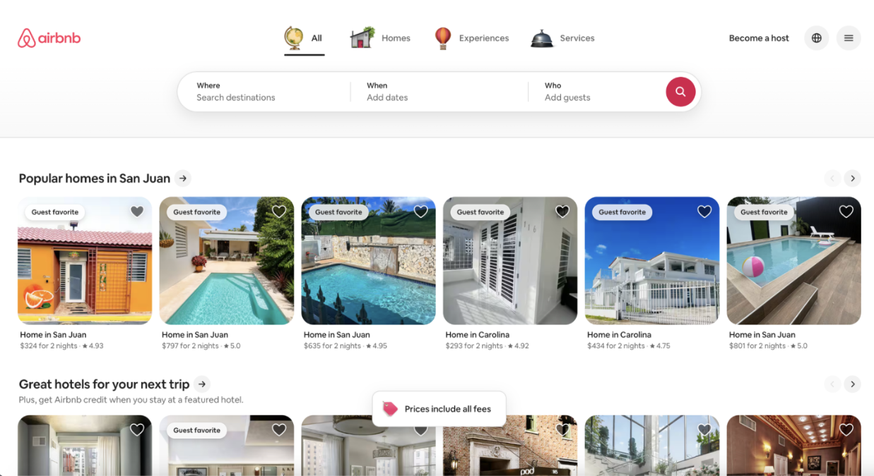
Airbnb creates a very different visceral experience. Instead of focusing on individual products, the website relies heavily on photography of destinations, homes, and experiences.
The images make users imagine themselves traveling and experiencing the places shown on the screen. The prominent search interface also immediately communicates that the website is designed around finding somewhere to go.
Airbnb therefore feels welcoming, exciting, comfortable, adventurous, and curious.
The biggest difference is that Apple makes its products look desirable, while Airbnb makes the experience of traveling look desirable.
2. Behavioral: How Well Does It Work?
The behavioral level focuses on what happens when we actually use a website. A website can look amazing, but if users cannot figure out how to accomplish their goals, the design has failed at the behavioral level.
Apple
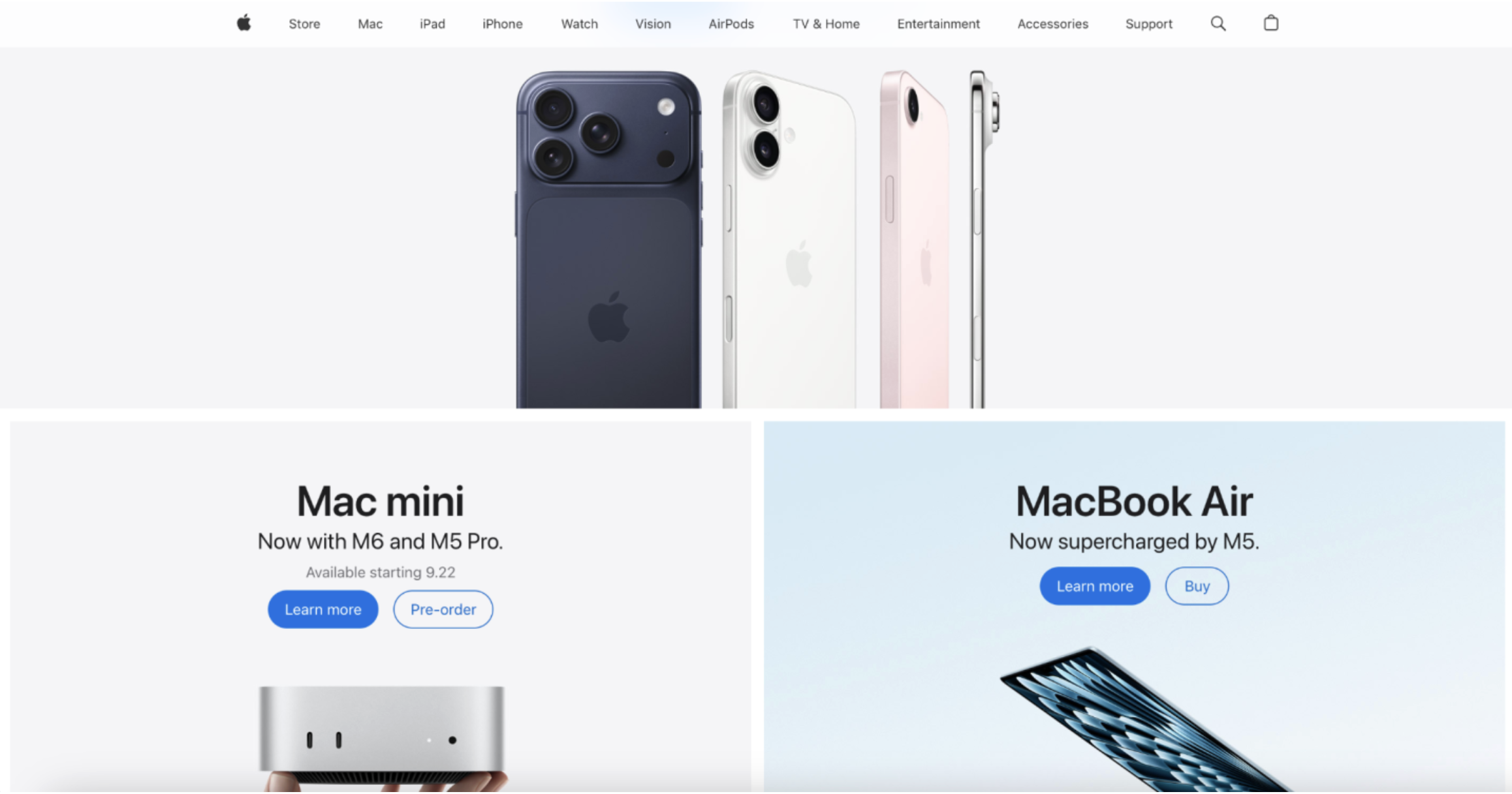
Apple’s navigation is organized around recognizable product categories such as Mac, iPhone, iPad, Watch, and AirPods. This makes it easy for users to identify where they need to go.
Apple also uses clear calls to action such as “Learn more” and “Buy.” These links communicate what users can do next without requiring much explanation.
This is also a good example of recognition rather than recall. Instead of making users remember where a product is located, Apple puts recognizable product categories directly in front of them. Recognition is generally easier than recalling information from memory because the interface provides users with cues (Budiu, 2024).
One weakness is that Apple’s homepage can be quite long. Someone who already knows exactly what they are looking for may find it faster to use the navigation or Store instead of scrolling through the promotional sections.
Airbnb
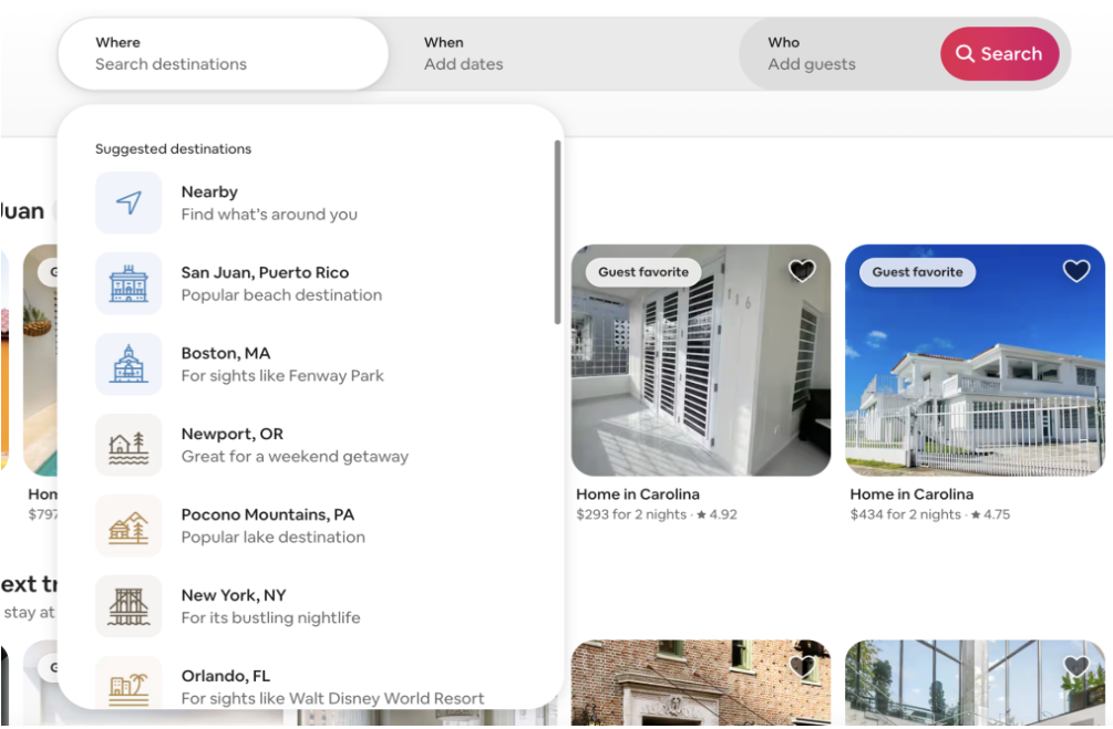
Airbnb’s behavioral design is built around the process of planning a trip. The search interface asks users where they are going, when they are going, and who is traveling.
This follows a familiar mental model. Users already have expectations about how travel websites work, so Airbnb does not require them to learn a completely new system. Mental models are the beliefs users develop about how a system should work based on previous experiences (Chan, 2024).
Airbnb also provides several types of feedback while users search, including photos, ratings, reviews, prices, availability, filters, and location information.
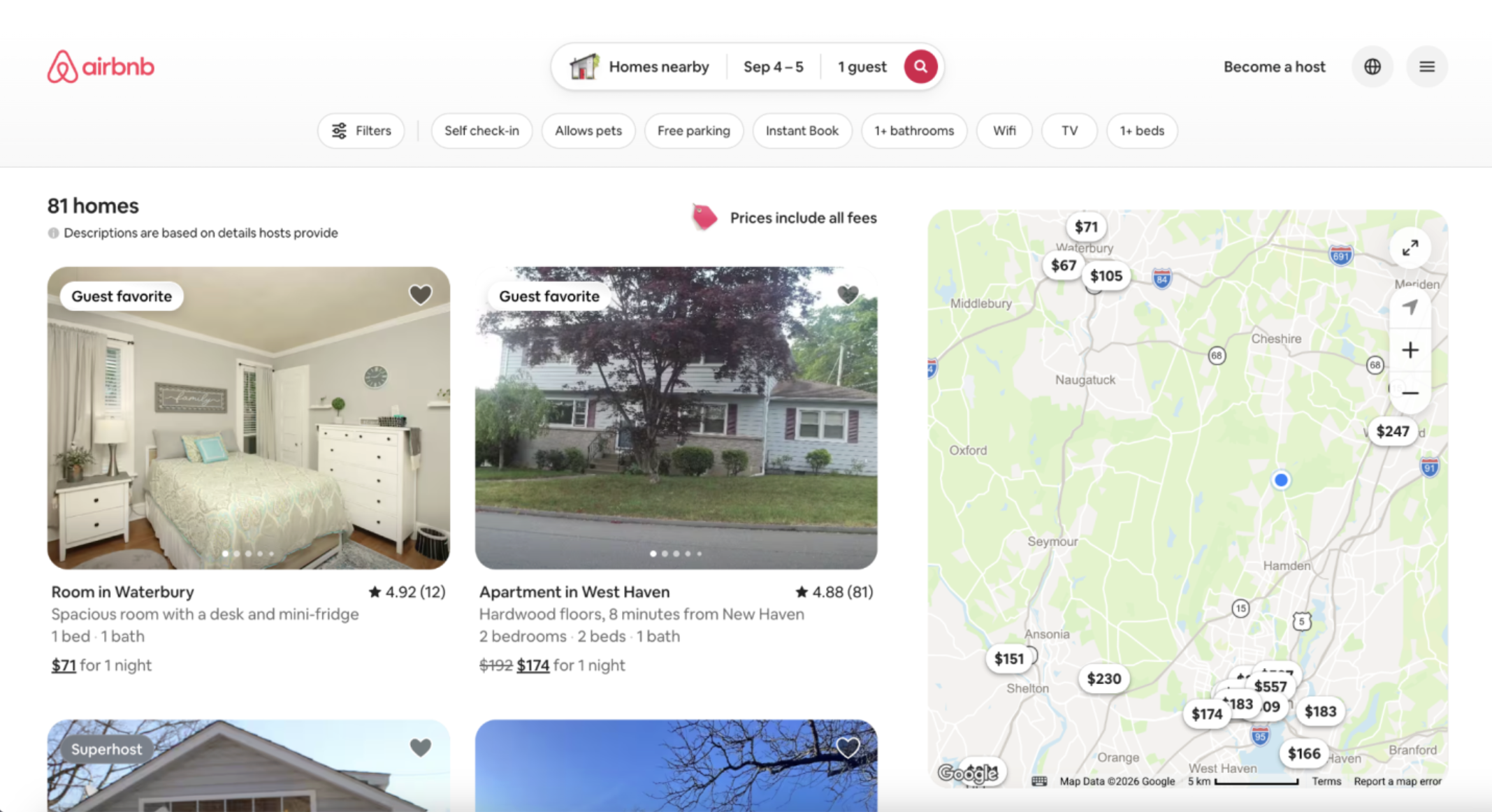
These features help users compare options and make decisions. However, Airbnb’s large number of choices can also become a weakness. Having so many listings and pieces of information available can create information overload, making it harder to decide between options.
3. Reflective: What Do We Remember?
The reflective level is about what a website means to us after we have interacted with it. It can influence how we view a company, what we associate with its brand, and whether we want to return.
Apple
Apple’s website reinforces the company’s reputation for innovation, quality, sophistication, and premium technology. The consistent visual style makes the brand immediately recognizable and presents Apple products as more than just functional electronics.
The website connects the products to ideas of creativity, productivity, lifestyle, and status. This creates a lasting impression that goes beyond simply buying a computer or phone.
Apple’s website doesn’t just sell technology. It sells the idea of an Apple lifestyle.
Airbnb
Airbnb creates a different reflective experience. Rather than presenting itself as simply a place to book a room, it connects its brand with travel, discovery, community, and memorable experiences.
The photography and variety of destinations can make users want to explore even when they are not actively planning a trip. Reviews and ratings also help establish trust in a platform where users are making significant purchasing decisions.
Airbnb sells more than a place to sleep. It sells the possibility of a memorable experience.
Why All Three Levels Matter
Looking at Apple and Airbnb through Norman’s Three Levels of Processing shows that successful web design is about more than simply making a website attractive.
The visceral level gets our attention and creates an immediate emotional response. The behavioral level determines whether we can actually accomplish what we came to the website to do. The reflective level affects what we remember about the experience and what the brand means to us afterward.
Apple demonstrates this through its premium visual presentation, recognizable navigation, and strong association with innovation and quality. Airbnb uses travel photography, familiar search patterns, detailed feedback, and an emphasis on experiences to create a different but equally intentional experience.
The two websites ultimately have very different goals. Apple makes users think about what they want to own, while Airbnb makes users think about where they want to go.
That is what makes the Three Levels of Processing useful for analyzing websites. A good website does not just look good. It creates an emotional reaction, helps users accomplish their goals, and leaves them with a lasting impression.
Sources
Course readings:
Komninos, A. (2020). Norman’s Three Levels of Design. Interaction Design Foundation.
Interaction Design Foundation — Norman’s Three Levels of Design
Chan, M. (2024). Mental Models. Nielsen Norman Group.
Nielsen Norman Group — Mental Models
Budiu, R. (2024). Recognition and Recall. Nielsen Norman Group.
Nielsen Norman Group — Recognition and Recall
Websites analyzed:
