
Package Redesign
Surfside Cans
This Surfside Hard Tea packaging redesign was a 4‑week project focused on understanding and applying the fundamentals of packaging design. The assignment required students to research an existing product, analyze its audience and competitors, and redesign the packaging using contemporary design principles, sustainability considerations, and a strong visual identity. My goal was to elevate Surfside’s existing brand presence while maintaining the approachable, refreshing personality that makes the drink popular.
Role: Packaging Designer, Brand Researcher
Timeline: 4 weeks
Tools: Adobe Illustrator, Adobe Photoshop, Mockup Templates
Format: Packaging redesign + three design comps + research documentation
The Problem
Understanding Packaging as a Communication Tool
Packaging is often the first interaction a consumer has with a product. For Surfside Hard Tea, the existing packaging communicates flavor and brand personality, but there are opportunities to improve clarity, shelf impact, and modern appeal.
Design Challenge
Redesign Surfside Hard Tea’s packaging by:
Identifying the target audience
Analyzing competitors in the hard tea and canned beverage market
Establishing clear design goals
Creating three distinct design concepts
Choosing colors, typefaces, and imagery that elevate the brand
Designing a final packaging system and mockups
Considering sustainability and modern packaging trends
Competitive Analysis
I analyzed brands such as:
Twisted Tea
Arnold Palmer Spiked
Truly Iced Tea
White Claw Iced Tea
Key takeaways:
Competitors rely heavily on bold colors and large typography
Many brands use busy layouts that can feel cluttered
Surfside’s current design is recognizable but could be more modern and cohesive
There is an opportunity to create a cleaner, more premium look
Research/Inspiration
Comps
Originally envisioned making the can look like it had a lot going on while only keeping a few simple colors. However as you’ll see I went in a different direction to stick with my goal of making a cleaner more premium look to the cans.
Color, Typography & Imagery
Color Palette
I selected colors that reflect:
Refreshing pastel colors to contrast with the logo being deep blue.
Summery, beach‑inspired tones
Clear differentiation between flavors
Problem Statement
Surfside Hard Tea needs packaging that better reflects its refreshing flavor profile, stands out against competitors, and communicates its brand identity more clearly while remaining visually appealing and sustainable.
Audience & Competitive Research
I began by researching Surfside’s current audience and the broader hard tea market.
Audience Insights
Surfside appeals to:
Young adults (21–35)
Casual drinkers who enjoy flavored teas
People who prefer light, refreshing alcoholic beverages
Consumers drawn to beach‑inspired, summery branding
Design Goals & Objectives
Based on research, I established the following goals:
Increase shelf visibility through stronger hierarchy and bolder color blocking
Modernize the brand with cleaner typography and simplified layouts
Improve flavor differentiation using color, iconography, or pattern
Enhance brand storytelling through imagery and tone
Consider sustainability by designing with minimal ink coverage and recyclable materials
Maintain Surfside’s approachable, beach‑inspired personality
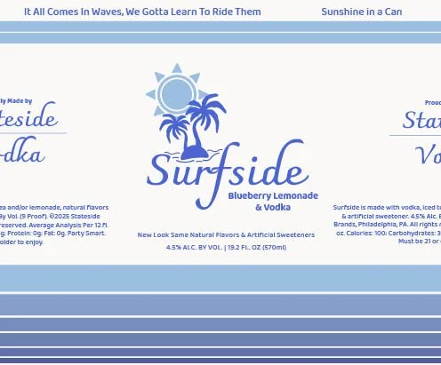
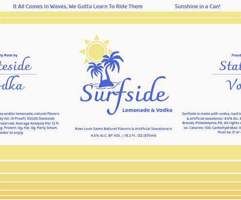
Comp 2
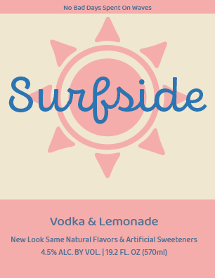
This comp was my least favorite, I simply didn’t spend a lot of time on it since at this time my final comp really stuck out to me as the one I wanted to go with. My design choices were to go with a very simple design and stick as closely to the source material as possible but making the colors all into one unlike the stripes they do on their cans now. However this proved to be a mistake as it lost a lot of it’s charm and became extremely boring to look at. I planned to edit it more but I felt it was good to leave it this way to show myself what not to do for the final design, and for any other designs going forward.
Typography
I chose typefaces that:
Feel modern and clean
Maintain Surfside’s casual, friendly tone
Improve readability on shelves
Create a strong hierarchy between brand name, flavor, and details
The main typeface used for “Surfside” is called Charmonman and is in bold.
All other text in the typeface Baloo Bhai 2. (Varying Weights)
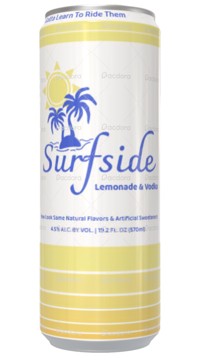
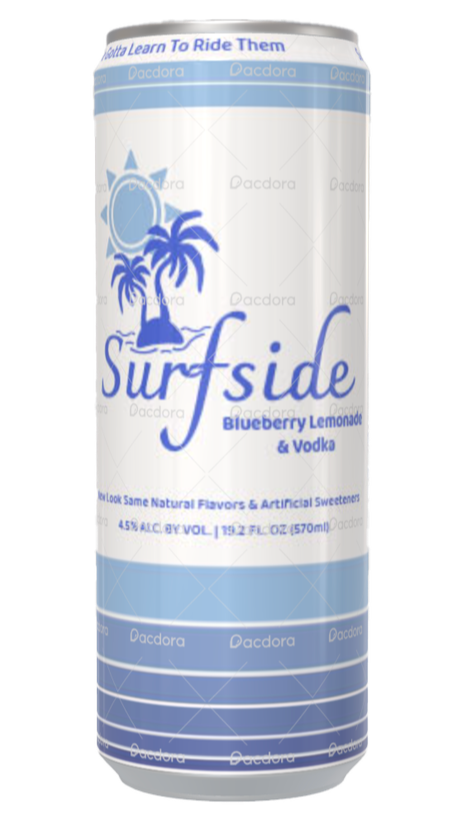
Final Packaging Design
The final Surfside Hard Tea redesign presents a cleaner, more modern, and more cohesive brand identity.
Mockups
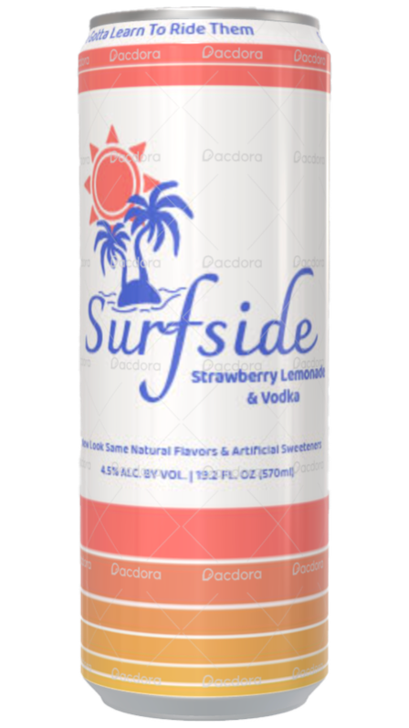
3d mockup made possible using the free version of Pacdora.
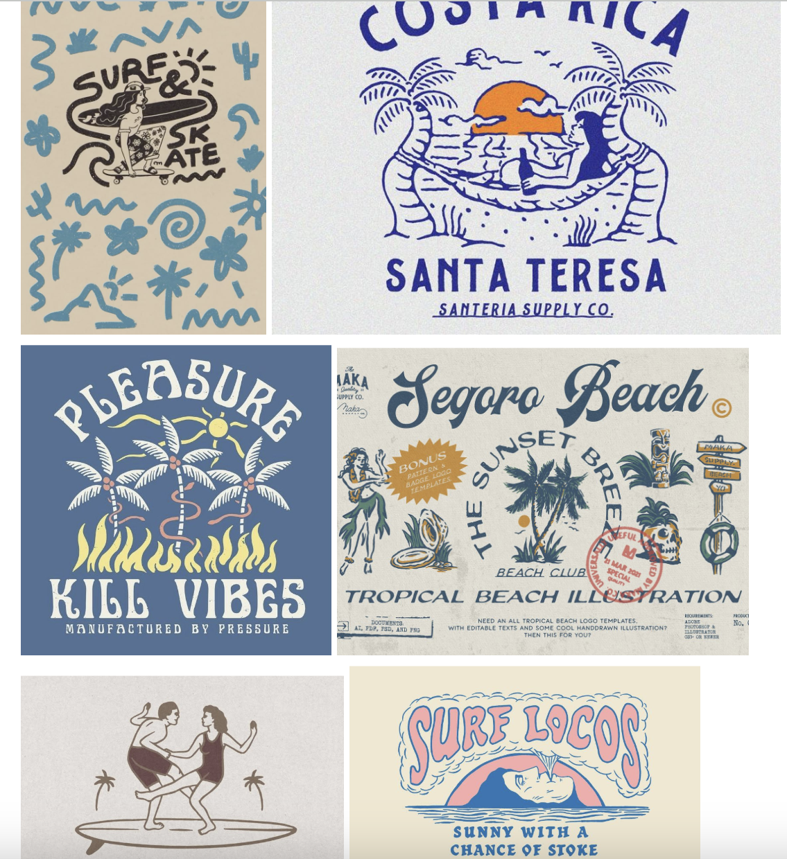
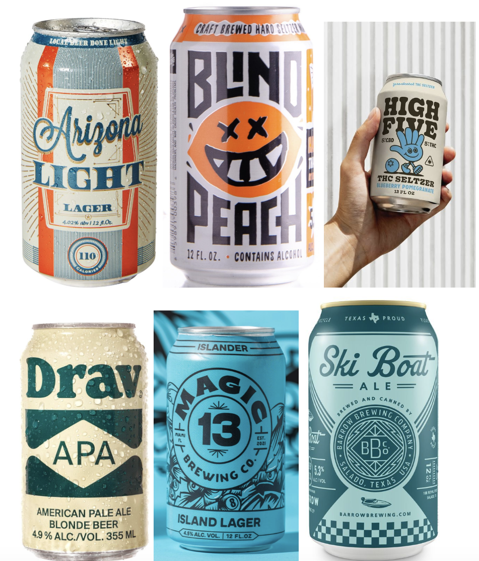
These images like the beer cans, were found on Pinterest. In these images I really wanted to replicate the colors and designs. I wanted the cans to have a surf shop identity. Meaning it had the look of a t shirt graphic or
Comp 1
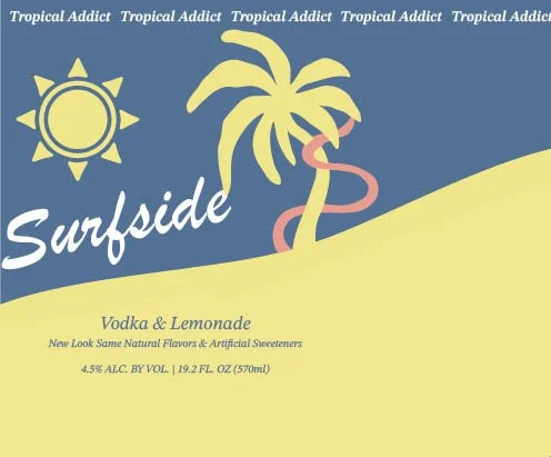
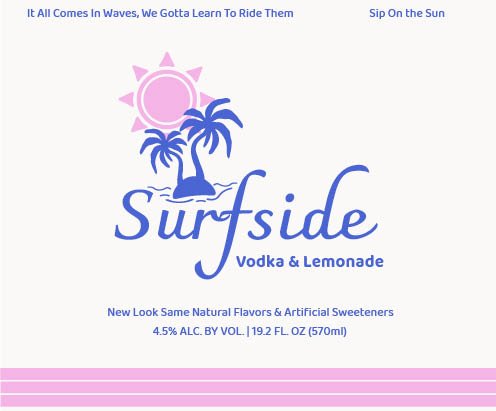
With this comp I really wanted to make the can unique. Using the beer cans I leaned more into filling up the can with big graphics that loomed around the title of the drink. The comp is meant to wrap around a skinny can however, which posed a problem for this design. Not only that I felt that it wasn’t as strong as my later options. If I decided to edit and play with this more I would have done a lot differently. But for the sake of time I was forced to move on. However I did enjoy the sun and palm tree graphics I had made in Illustrator. The sun felt reminiscent of the original Surfside logo just without the lemon slices inside. So I decided to utilize these later.
Comp 3
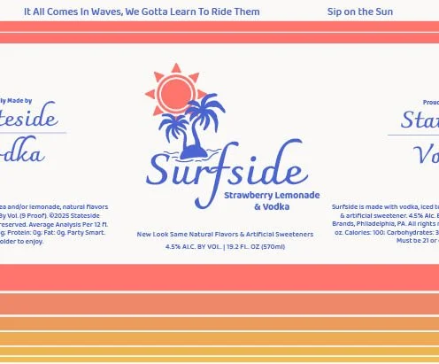
My final comp was a long process and took away all my attention from the first two. I started off with a design that I was told by my peer reviewers had a lot of potential so I continued to change its design. After going through about 10 iterations of colors and lines I finally came up with something I really liked. (The design showed here is not my final design just the original iteration). The final design utilizes the stripes that Surfside’s are known for having, while still taking elements from my earlier designs with the sun, palm tree and taglines at the top.
Future Development
If developed further I would add:
Expanded Flavor System — Creating a full flavor family with consistent structure and unique colorways.
Seasonal Editions — Designing limited‑edition packaging for summer, holidays, or collaborations.
Point‑of‑Sale Displays — Extending the redesign into retail displays, signage, and promotional materials.
Sustainability Enhancements — Exploring eco‑friendly inks, textured recyclable materials, or embossed aluminum.
Brand Story Elements — Adding small storytelling touches like taglines, illustrations, or origin notes.
In order to really tell how my design looked on a can without actually having one on hand was to find somewhere to get a good mockup. On the website Pacdora, I was able to put my email in and paste my designs on a replica can so I could see how they looked. This helped me with my first design, originally I put the title right in the middle but with this I was able to see that customers purchasing these cans would only see parts of the title. Also it made me realize that the back of the can was plain white so I added a back to it, the text being ripped straight from a real Surfside can.
Retrospective
This project highlighted the importance of designing packaging that balances aesthetics, clarity, and brand personality. Working on Surfside reinforced:
Designing for the shelf — Packaging must stand out from a distance and communicate instantly.
Understanding the audience — Knowing who buys Surfside shaped every design decision.
Iterating through critique — Feedback helped refine hierarchy, color choices, and layout clarity.
Balancing creativity with practicality — Packaging must be beautiful, but also printable, sustainable, and functional.
Overall, this project strengthened my ability to design packaging systems, conduct competitive research, and create visually compelling work that aligns with real‑world brand needs. It deepened my understanding of how packaging can influence perception, storytelling, and consumer choice.