
Type Specimen Booklet
Athelas
This 12‑page type specimen booklet was created for Typography II as a deep exploration of the serif typeface Athelas. The assignment challenged students to design a dynamic, grid‑driven publication using only two spot colors (and their tints), showcasing the typeface’s history, structure, and expressive potential. My goal was to create a booklet that not only demonstrated Athelas’s versatility but also presented it as a refined, market‑ready type family worthy of professional use.
Role: Typographer, Layout Designer
Timeline: 4 weeks
Tools: Adobe InDesign, Adobe Illustrator
Format: 12‑page printed/digital booklet (vector‑only)
The Problem
Selling a Typeface Through Design
A type specimen isn’t just informational — it’s persuasive. The challenge was to create a booklet that:
Demonstrates Athelas’s full character set
Communicates its historical and stylistic context
Uses layout, hierarchy, and color to highlight its strengths
Feels visually compelling enough to “sell” the typeface to designers
My Process
Research & Type History
I began by researching Athelas — its origins, typographer, classification, and intended use cases.
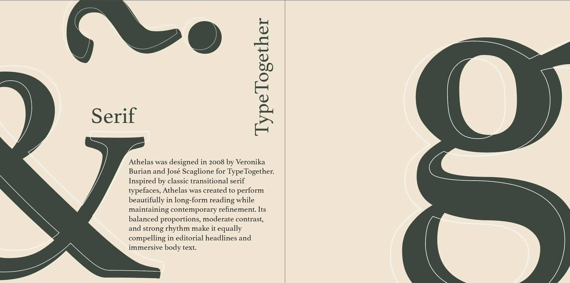
Athelas was designed in 2008 by Veronika Burian and José Scaglione for TypeTogether. Inspired by classic transitional serif typefaces, Athelas was created to perform beautifully in long-form reading while maintaining contemporary refinement. Its balanced proportions, moderate contrast, and strong rhythm make it equally compelling in editorial headlines and immersive body text.
Key insights:
Athelas was designed for literary reading
It has a refined, book‑type serif structure
Its elegance comes from subtle contrast and classical proportions
These qualities shaped the tone and visual direction of the booklet.
The Final Booklet
The final 12‑page specimen presents Athelas as:
Elegant
Versatile
Literary
Professional
The final booklet presents Athelas as a timeless serif with both classical roots and modern versatility.
Comp 1

Problem Statement
Designers need a type specimen that clearly communicates Athelas’s beauty, versatility, and typographic personality through a structured, engaging, and historically informed publication.
Concept Development
I explored how Athelas’s history and personality could inform the design. Because the typeface is known for its literary elegance, I leaned into:
Clean, book‑inspired layouts
Generous margins
High contrast between display and body sizes
A restrained but expressive color palette
Initial Compositions
I created three distinct design directions, each with:
A cover concept
A sample interior spread
Comp 2
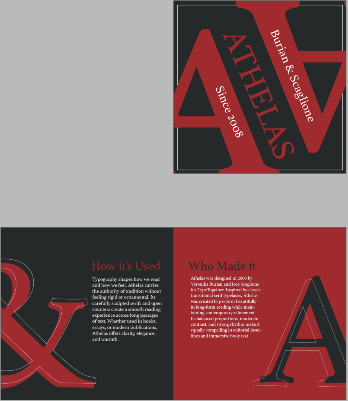
Here’s the second. I personally really liked this one, I thought the colors were fun to use and liked the design choices I made. Specifically with the outline coming off the big letters. During critiques I was told the colors didn’t feel right but the design was great so I ended up reusing it in my final design.
Comp 3
Grid, Layout, & Structure
Using InDesign, I built a flexible grid system that supported:
Wide margins
Multi‑column text flow
Modular headline placement
Dynamic white space
This grid allowed each spread to feel unique while maintaining consistency across the booklet.
Typography & Content
The booklet includes all required typographic elements:
Typeface Information
Typeface name: Athelas
Designer: Veronika Burian and José Scaglione
Year designed: 2008
Classification: Transitional Serif
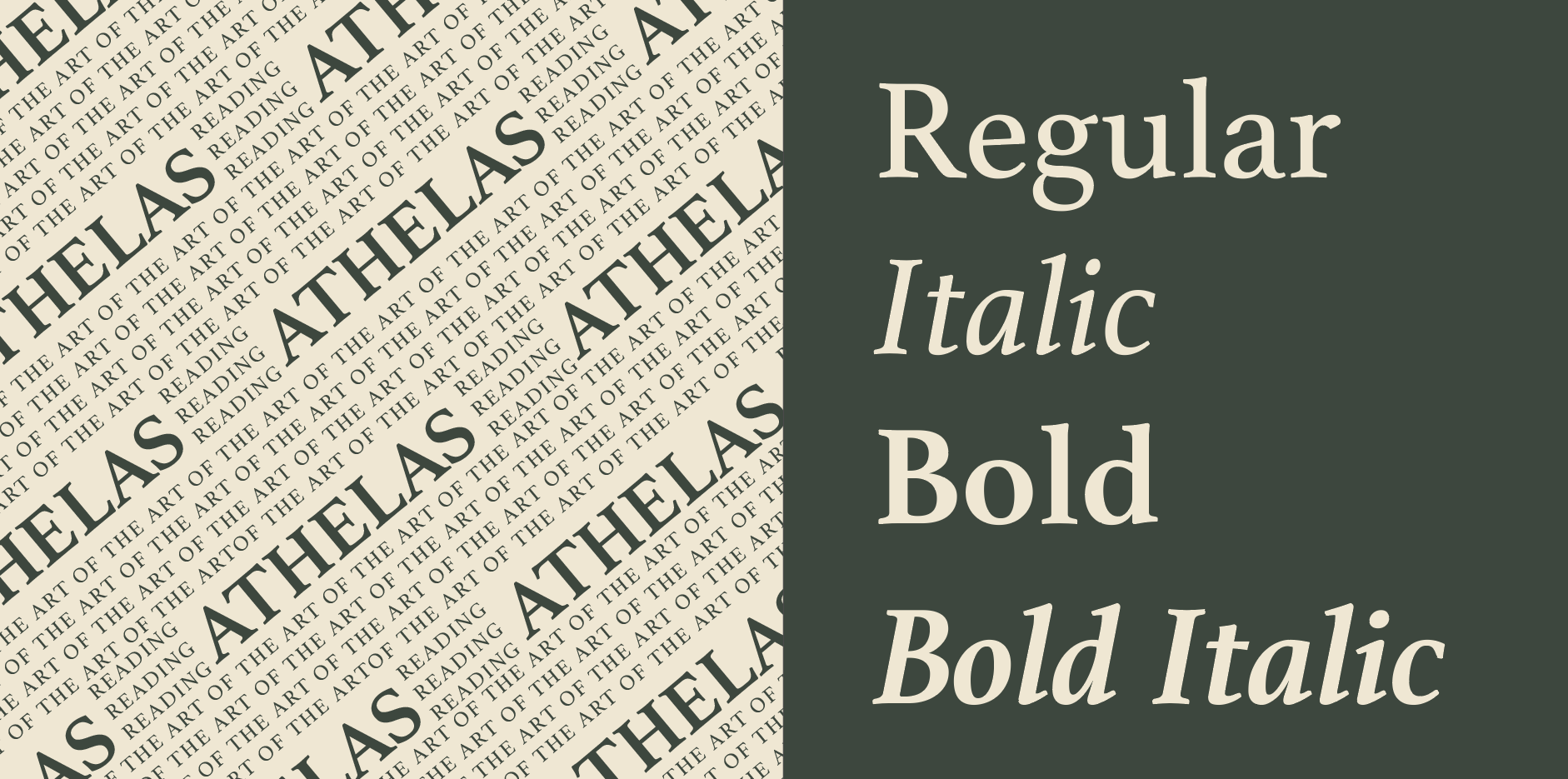
Type Family Styles
Type styles included:
Regular
Italic
Bold
Bold Italic
Front of Book
Design Challenge
Create a 12‑page type specimen booklet that:
Uses a dynamic typographic grid
Employs two spot colors and their tints
Includes full alphabet sets, body text samples, headline samples, and style variations
Reflects the history and classification of Athelas
Balances expressive design with typographic clarity
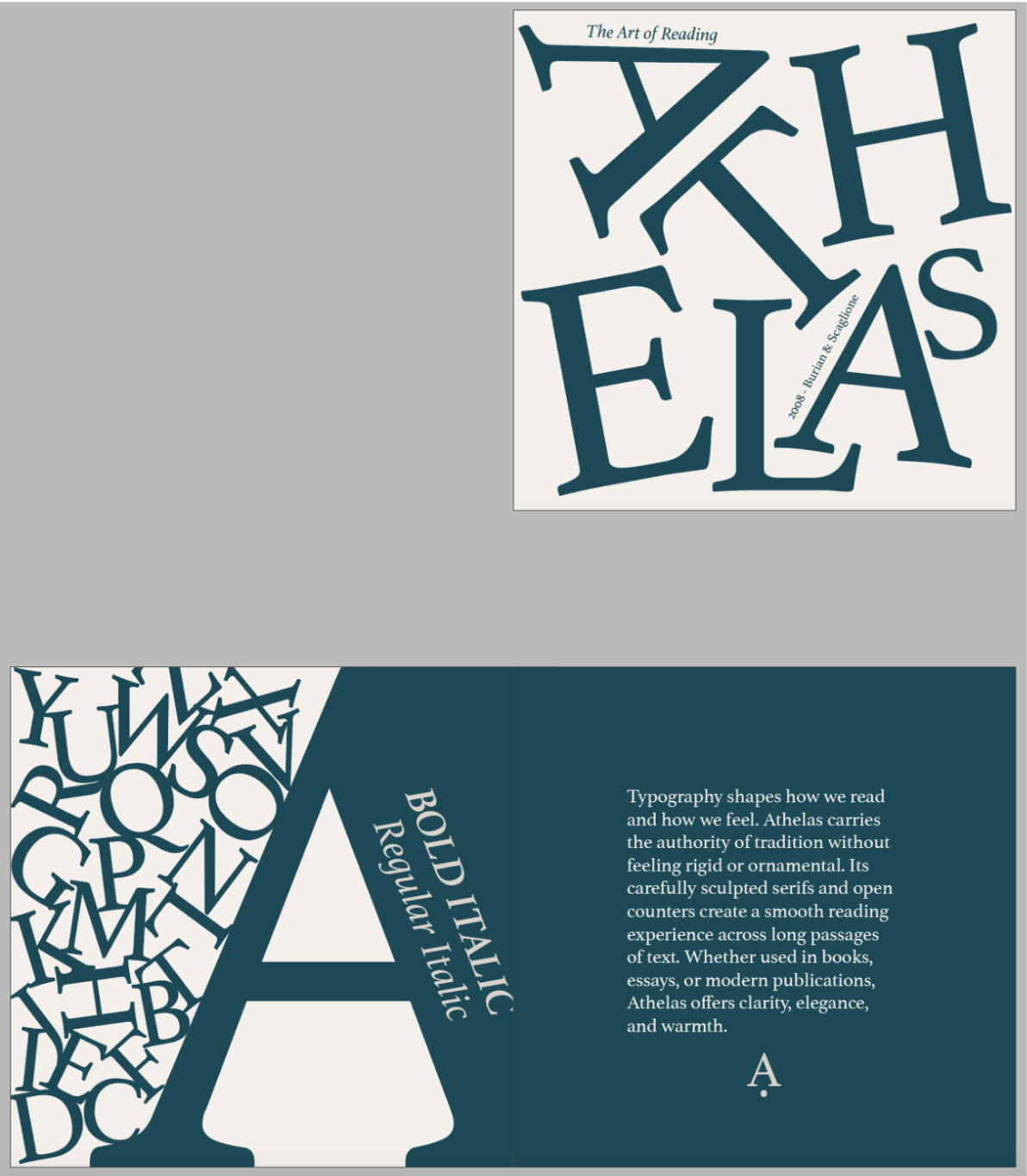
This is my first comp, I liked these colors a lot but during critiques people seemed to not like the cover very much and felt I didn’t need all the letters on the left.
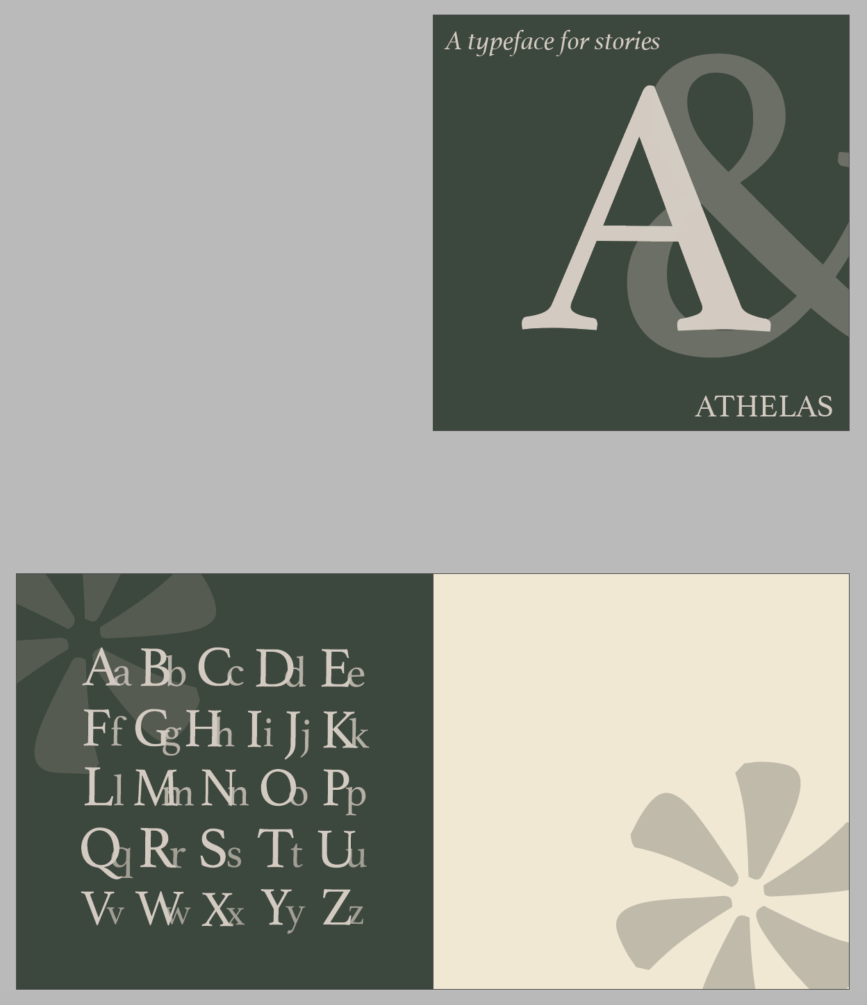
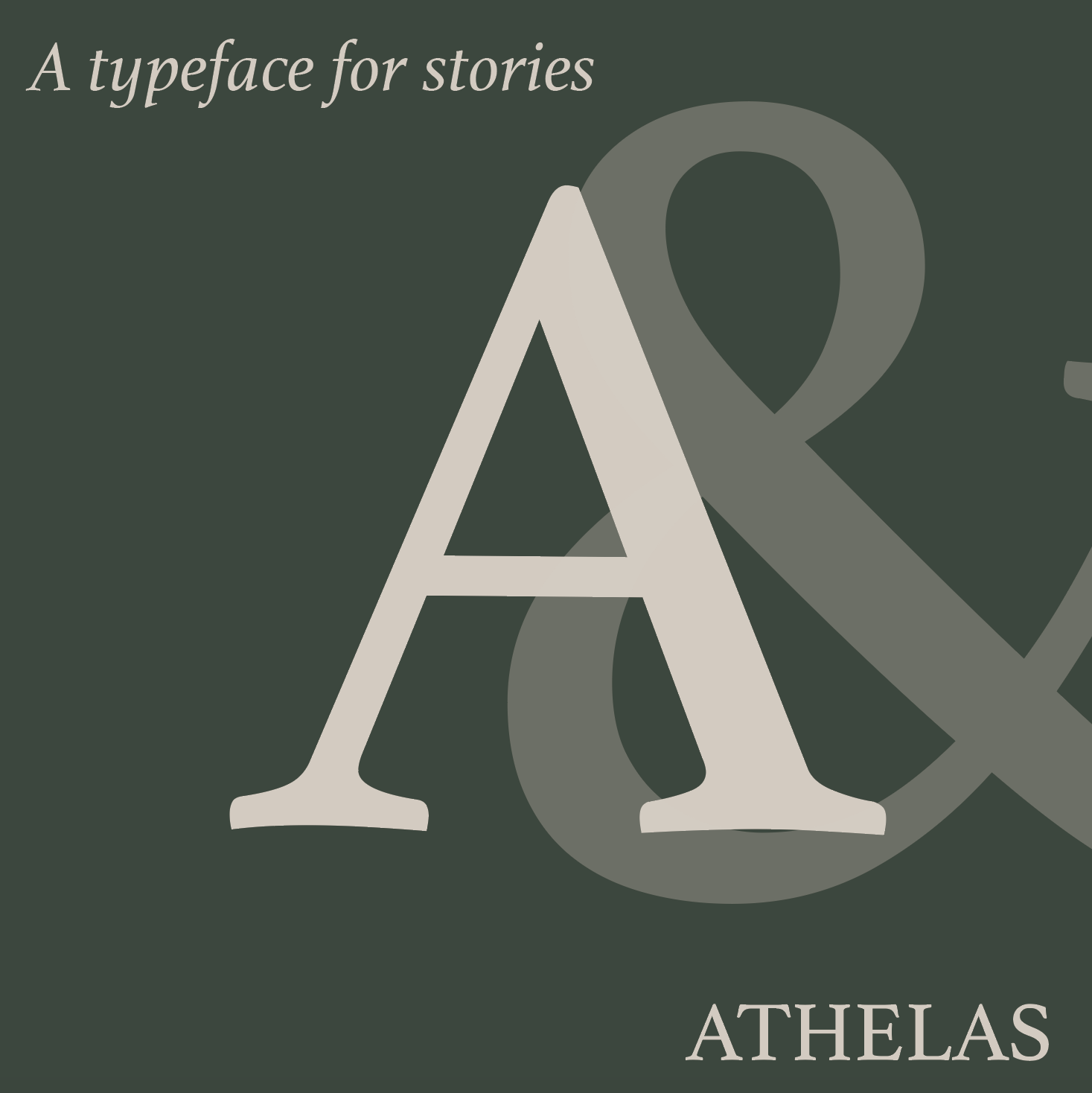
This was my third comp, during critiques, everyone that I talked to seemed to unanimously agree this was the best choice of color and design. Everything I used to design this was using the typeface, the flower looking design is just an Asterix (*) made really big. This was also the comp I chose for my final design and full booklet.
Color Palette
Two spot colors (and their tints) were used to:
Highlight typographic features
Create visual rhythm
Add personality without overwhelming the type
The green and beige palette was chosen because I felt it had a calm, easy to look at tone, and supported Athelas’s book‑type personality without overpowering the typography.
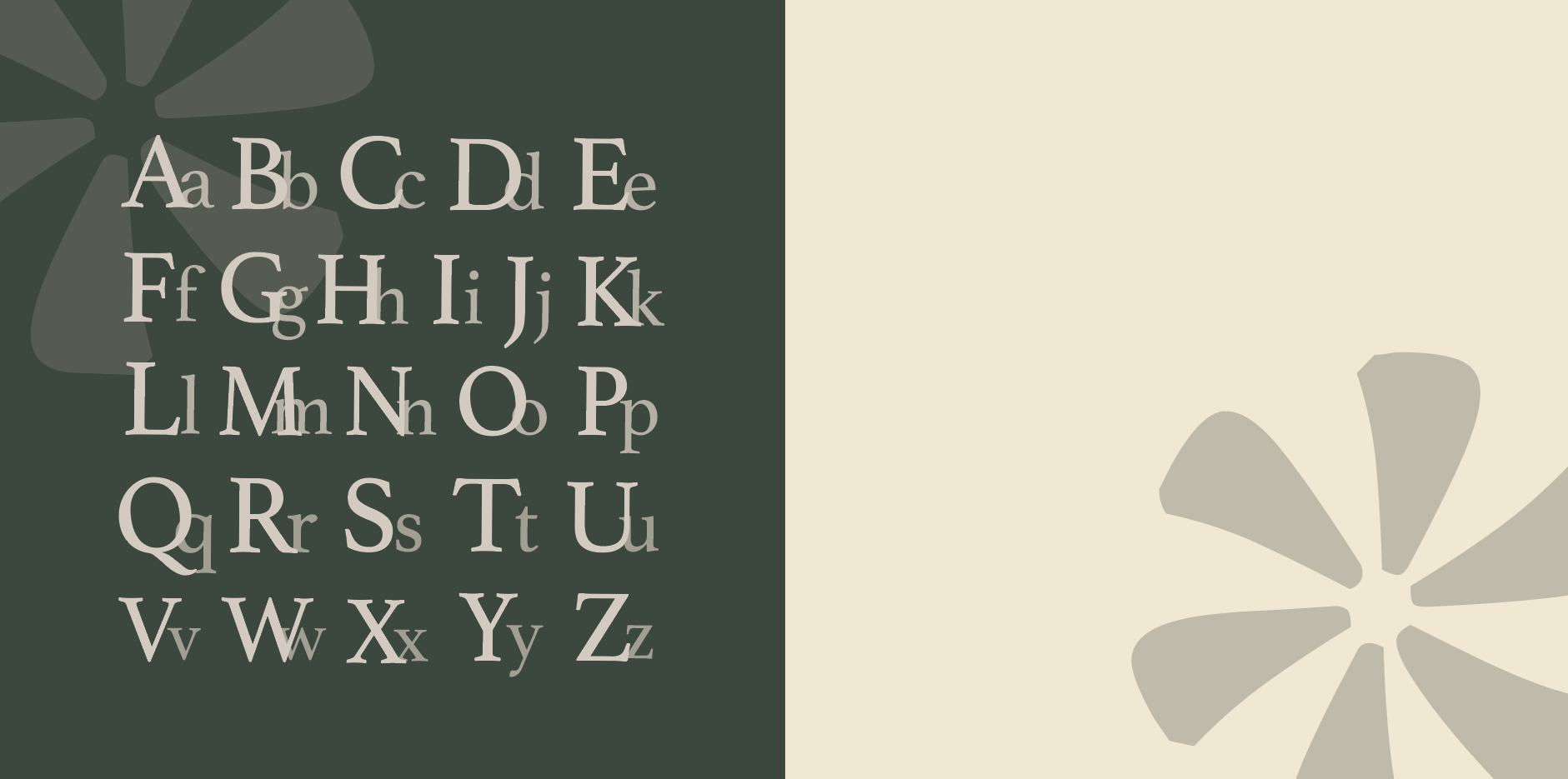
Alphabet Sets
Full uppercase alphabet
Full lowercase alphabet
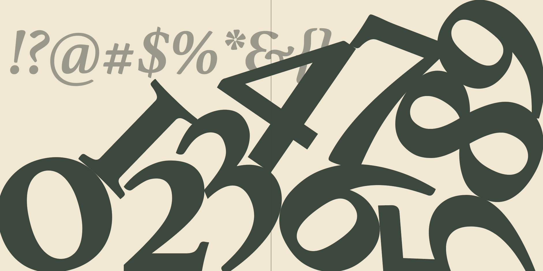
Numerals and punctuation
Body Text Samples
10–15 samples demonstrating:
Paragraph rhythm
Line spacing
Readability at small sizes
Visual Design Strategy
My visual approach emphasized:
Athelas’s literary roots
Clean, elegant compositions
Strong typographic hierarchy
Playful but controlled use of color
Dynamic spreads that feel modern while honoring classical serif design
Each page was designed to highlight a different strength of the typeface — from delicate italics to bold display settings.
Key Features
Dynamic grid‑based layouts
Two‑color system with tints
Full alphabet and style samples
Body and headline demonstrations
Historical context and typographic notes
Clean, modern compositions that highlight Athelas’s strengths
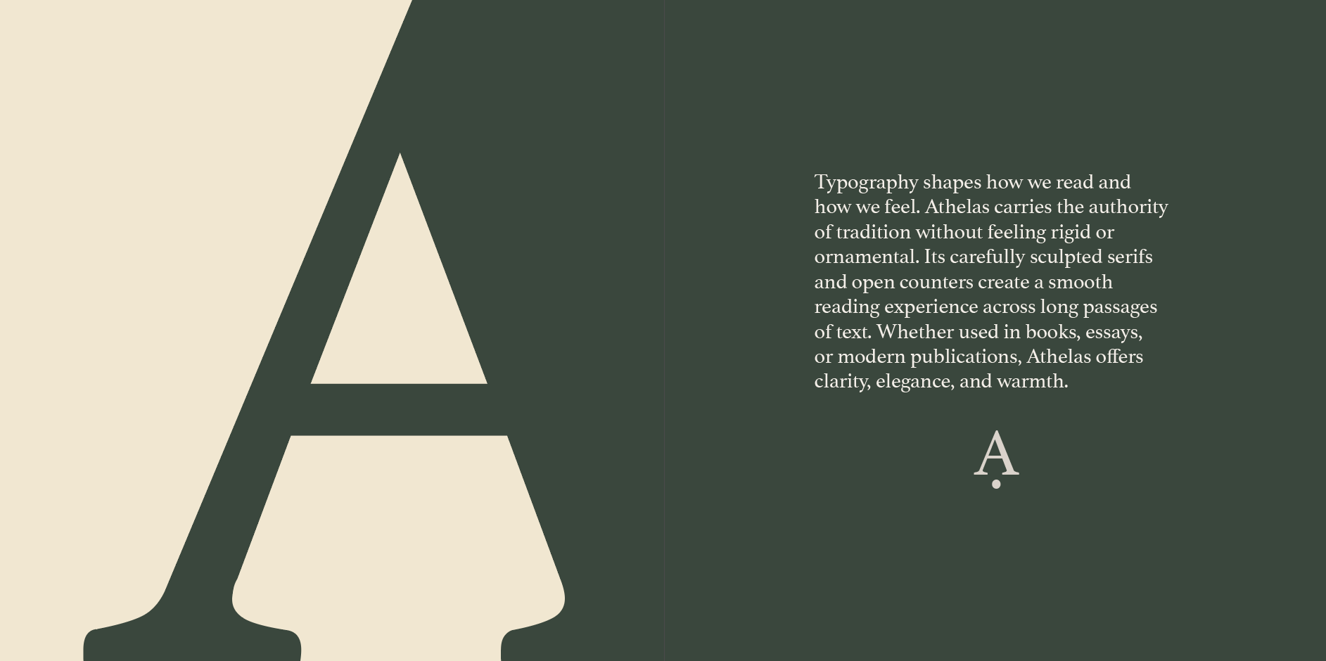
First Spread

Green: #515d51
Beige: #cec6bf
Headline Samples
10–15 expressive headline treatments showing:
Contrast
Weight
Character personality
Iteration & Refinement
After critique, I refined:
Margin proportions
Color balance
Leading and tracking in body samples
Hierarchy between headings and subheadings
Page pacing to ensure variety across the 12 pages
Overall Tone
The booklet feels:
Refined
Bookish
Contemporary
Carefully crafted
It positions Athelas as a typeface suited for editorial design, publishing, and high‑quality print work.
Second Spread
Third Spread
Fourth Spread
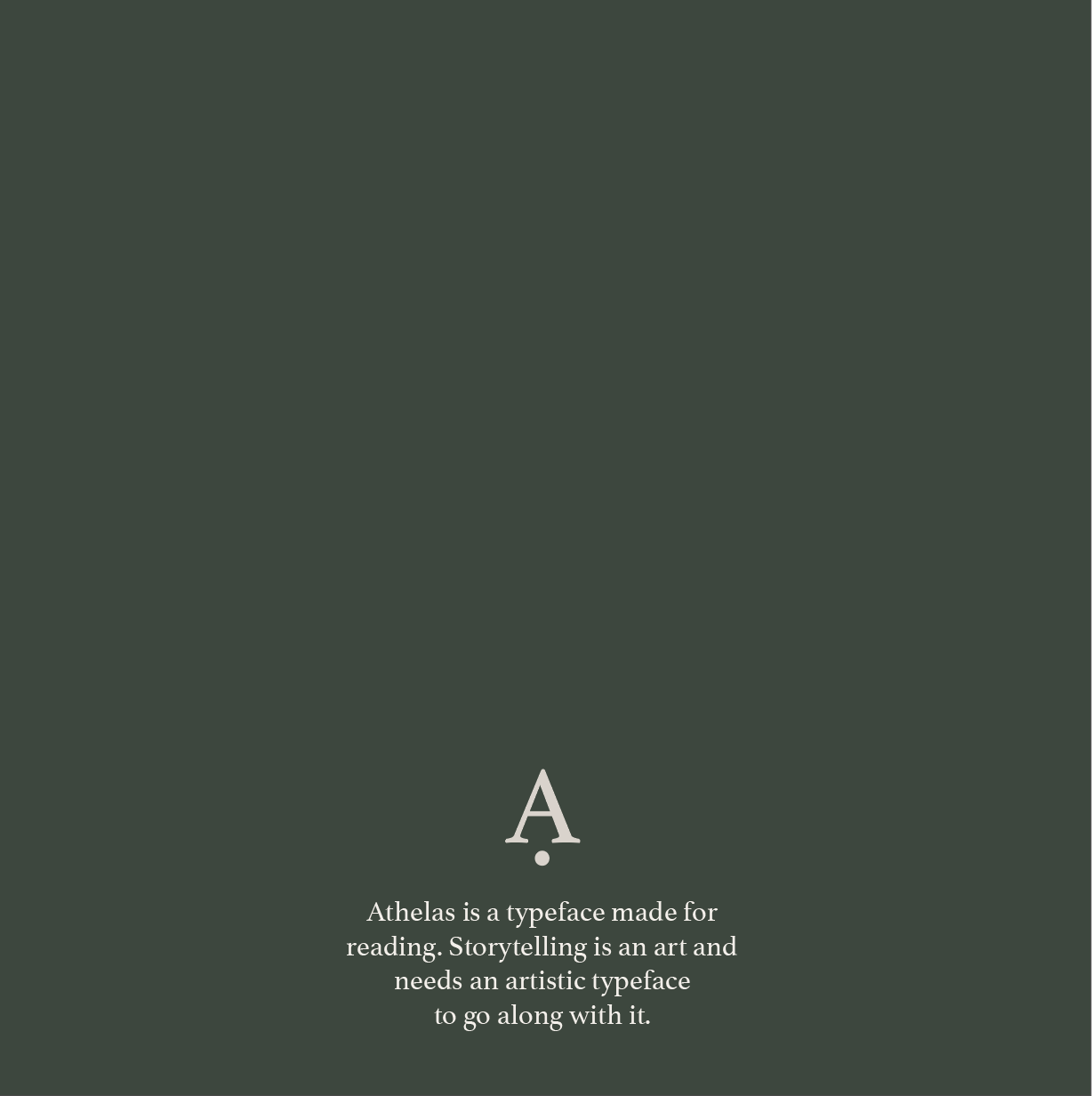
Fifth Spread
Future Development
If developed further I would add:
Expanded Editorial Spreads — Designing mock magazine or book layouts to show Athelas in real‑world use cases.
Interactive Digital Version — Creating a scrolling web‑based specimen with animations and responsive typography.
Historical Timeline — Adding a visual timeline of Athelas’s development and influences.
Comparative Pages — Showing Athelas alongside similar serif typefaces to highlight its unique features.
Glyph Exploration — Including enlarged glyph studies to showcase curves, terminals, and contrast.
Back of book
Retrospective
This project highlighted the unique challenges of designing a publication where typography is both the content and the visual voice. Working on this booklet reinforced the importance of:
Designing with intention — Every typographic choice must serve both clarity and expression.
Letting the typeface lead — Athelas’s personality shaped the grid, color palette, and pacing of the booklet.
Balancing structure with creativity — The grid provided consistency, while color and scale added energy.
Iterating through critique — Feedback helped refine hierarchy, spacing, and page rhythm.
Overall, this project strengthened my ability to design typographic systems, build multi‑page publications, and create work that celebrates the beauty and function of type. It deepened my appreciation for how typography can communicate history, personality, and emotion through form alone.