
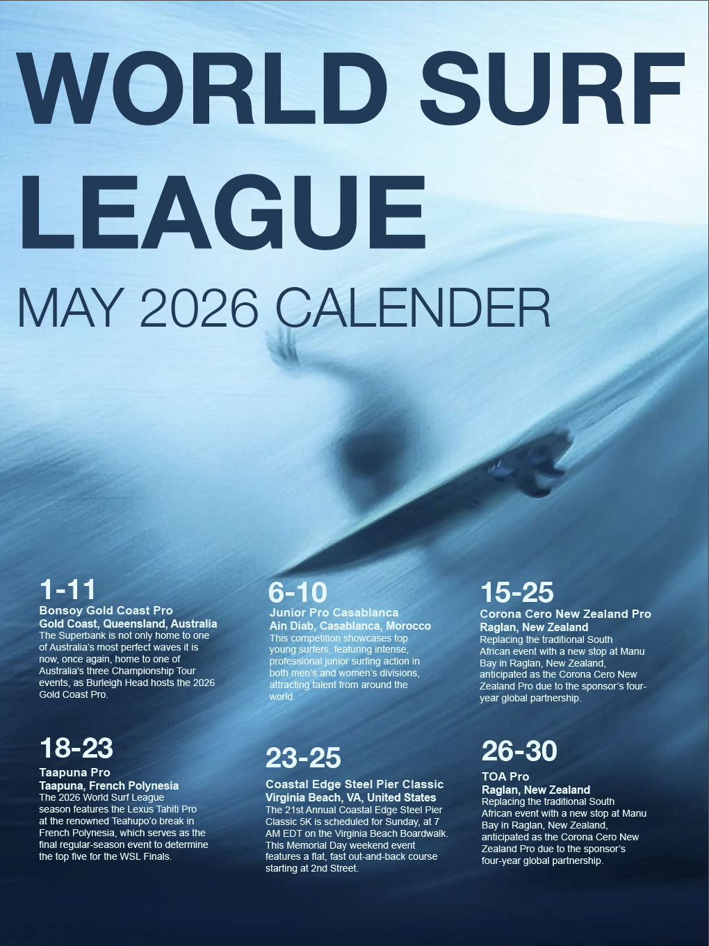
Large Format Event Calendar
World Surf League
This large‑format informational poster was created for my Information Design course, focusing on the integration of photography and typography to communicate event details clearly and efficiently. The assignment challenged students to design an 18x24‑inch event calendar using their own photography as the background, applying strong information‑design principles such as hierarchy, readability, balance, contrast, and grid‑based layout.
My goal was to create a visually striking poster that captures the energy of surfing while presenting a full month of World Surf League events in a clean, organized, and easy‑to‑scan format.
Role: Photographer, Information Designer, Layout Designer
Timeline: 2–3 weeks
Tools: Adobe InDesign, Adobe Photoshop
Format: 18x24" vertical poster (print‑ready, vector‑based)
The Problem
Designing Clear Information on a Photographic Background
Event calendars often struggle with clarity when placed over busy or high‑contrast imagery. The challenge was to design a poster that:
Uses photography as a full‑bleed background
Maintains strong readability
Presents multiple events with varying amounts of text
Establishes a clear visual hierarchy
Balances type and image without sacrificing either
Subject Exploration & Rationale
I chose to design a calendar for the World Surf League’s May events, inspired by the dynamic energy of surfing and the visual drama of ocean photography. Surf culture naturally pairs well with bold typography and high‑impact imagery, making it an ideal subject for an information‑driven poster.
Content Research & Text Development
I gathered:
Event names
Dates
Locations
Short descriptions for each event
This allowed me to create a poster with richer detail and stronger hierarchy, rather than relying on minimal text.
Photography Exploration
I studied:
Sports event posters
Surf photography layouts
Dramatic poses and action shots are most appealing
Images with clear color palettes
Key takeaways:
Bold condensed typefaces work well over action photography
High‑contrast overlays improve readability
Vertical rhythm is essential when listing multiple events
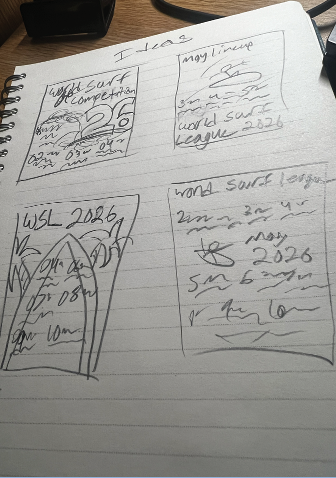
Early Ideas & Sketches
I sketched multiple layout ideas exploring:
Left‑aligned vs. centered text
Vertical vs. horizontal event groupings
Overlay boxes vs. direct type on image
Large vs. small date treatments
Comps
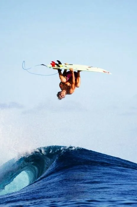
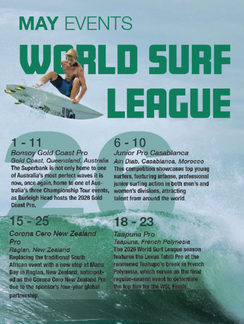
This was my first comp, I found this one to be really fun to work on. I stared out developing this poster before my second one since I thought it would be nicer for the viewer to look at but it took away from the surf competition aspect that I was trying to convey. The image felt too laid back for an extreme sport like surfing. I really liked the colors on this one as the color palette was something I took into heavy consideration early on in the designs.
Future Development
If developed further I would add:
Interactive Digital Version — A scrolling or animated version for web or mobile.
Seasonal Series — Posters for summer, fall, and winter events using a consistent system.
Iconography System — Small icons for event type, difficulty, or region.
Color‑Coded Regions — Assigning colors to continents or surf zones for faster scanning.
Merchandising Extensions — Turning the design system into shirts, banners, or social graphics.

Problem Statement
Users need a large‑format event calendar that communicates dates, locations, and descriptions quickly and clearly, even when viewed from a distance in a storefront or entryway.
Design Challenge
Create an 18x24" poster that:
Uses original photography
Applies a strong grid system
Organizes multiple events with clear hierarchy
Balances typography and imagery
Maintains readability across all text sizes
Feels visually cohesive and professionally polished
Visual Research & Inspiration
I studied:
Sports event posters
Surf photography layouts
Magazine‑style grid systems
High‑contrast type‑over‑image designs
Key takeaways:
Bold condensed typefaces work well over action photography
High‑contrast overlays improve readability
Vertical rhythm is essential when listing multiple events
Color Considerations
I selected a color palette that:
Contrasts strongly with the ocean background
Enhances readability
Feels energetic and athletic
The final palette used:
White for body text
Green for title and month of events
A low opacity blue for the 26 that appears behind the wave
Typography Explorations
I explored several typefaces before choosing a bold, condensed sans serif for:
Strong legibility
High‑impact titles
A modern, athletic tone
Secondary text used a clean sans serif for:
Event descriptions
Locations
Supporting details
My typefaces:
Amboy (Black)
Helvetica Neue (Light, Bold)
Arial Black (Regular)
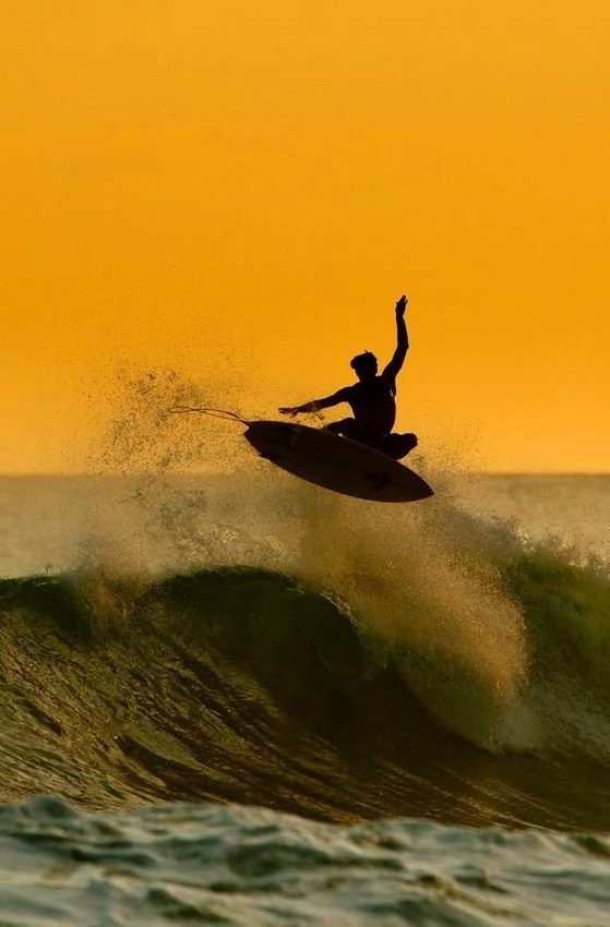
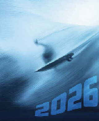
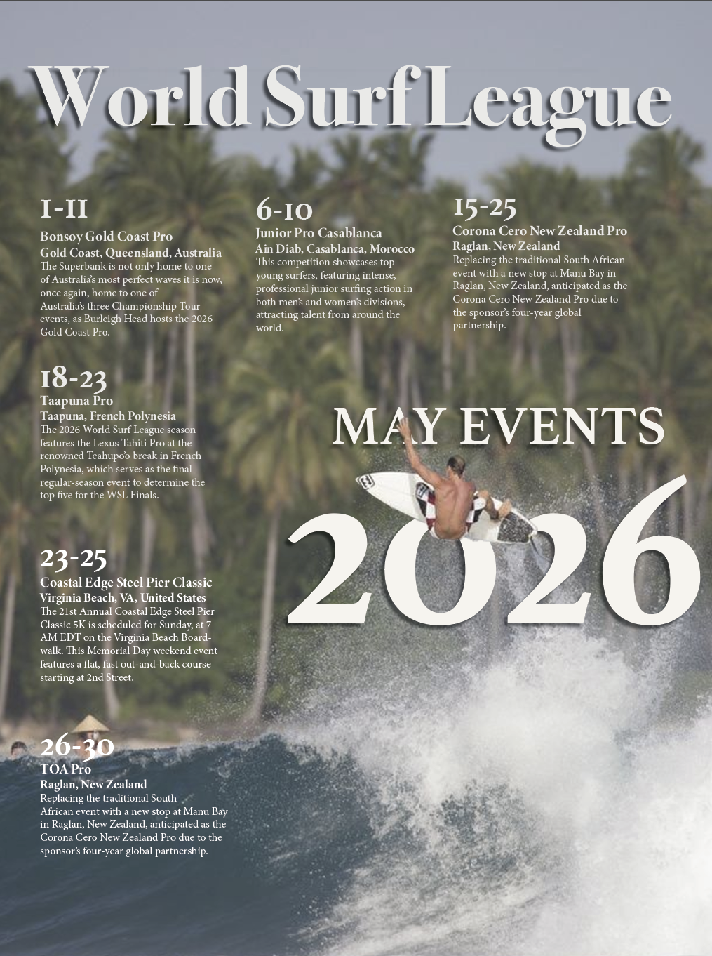
This was my second and favorite comp. Originally it was hard for mw to choose between this comp and the first one just because they each had colors that I found to be most interesting to look at and work with but in the end I chose this one to develop further since it had two elements that I sketched out which I really enjoyed. The giant 26 behind the wave and the surfer jumping over the title of the poster.
Final Design
The final poster presents the World Surf League’s May events in a clean, dynamic layout that balances bold typography with high‑energy photography.
Key Features
Full‑bleed surf photography
Strong vertical grid system
Clear hierarchy between dates, titles, and descriptions
High‑contrast type for maximum readability
Balanced negative space around event blocks
A modern, athletic visual tone
Event Structure
Each event includes:
Date range
Event title
Location
Short description
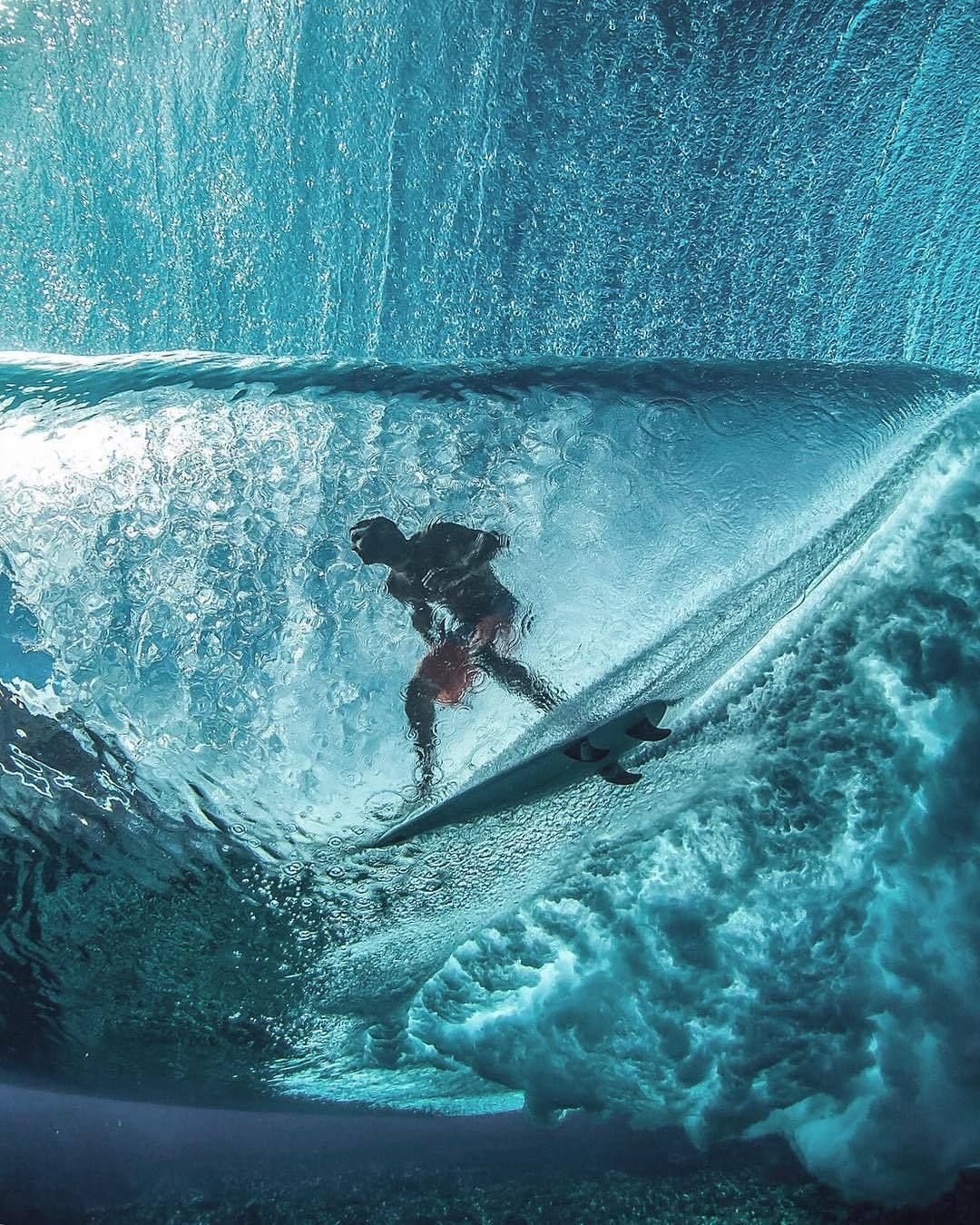
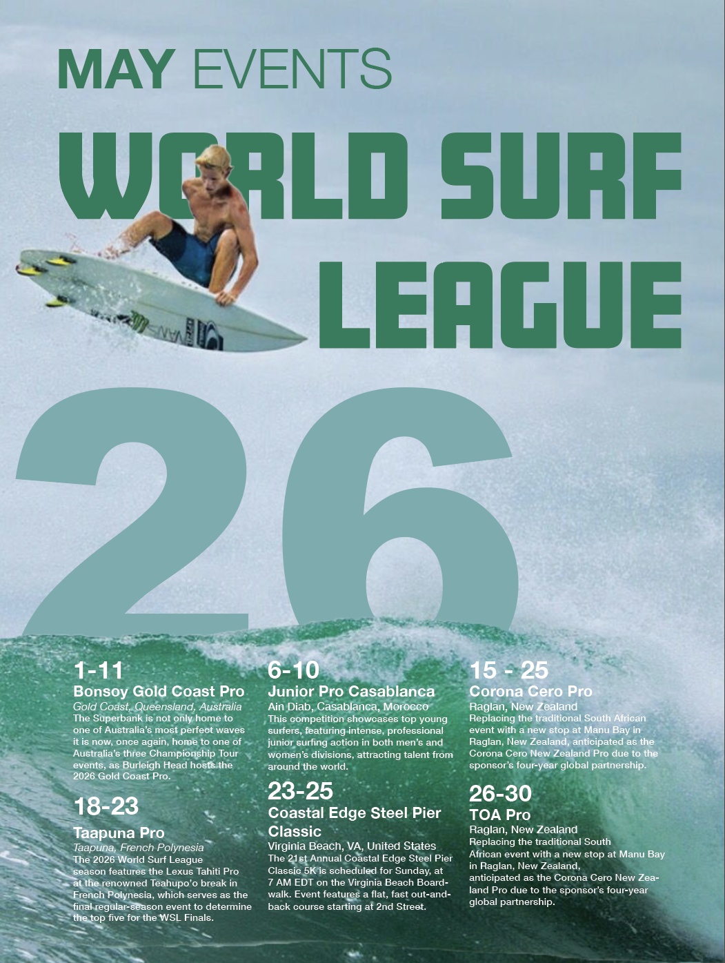
My third and final comp, I was able to use the surfer jumping over the text in this image but I started to fade away from it because I felt the design was a little boring. The typefaces I used for it were really cool to me but they didn’t look the greatest with the background I had so I used a drop shadow. Even though I chose not to continue this one I still find it cool and like that it ended up the way that it did I just know I could have done something better.
Retrospective
This project reinforced the importance of designing with both clarity and emotion. Working on the World Surf League poster taught me:
How to balance photography and typography — ensuring neither element overwhelms the other.
The power of hierarchy — especially when presenting multiple events with similar structures.
The importance of grid systems — which kept the layout clean and consistent across the entire poster.
How to design for distance — making sure the poster reads well from across a room.
Overall, this project strengthened my information‑design skills and deepened my understanding of how photography, typography, and layout work together to communicate quickly and effectively. It also helped me refine my ability to create polished, professional large‑format designs.