
Spotify New Feature
Shelves
Spotify Shelves is a 4‑week mobile experience redesign created for my UI/UX course on emulating and elevating existing mobile interfaces. The assignment challenged students to select an app they use daily, identify a frustration, and improve the experience through thoughtful UX and UI enhancements. Instead of redesigning Spotify’s visual identity, I focused on introducing a new organizational feature—Shelves—that allows users to categorize playlists more intuitively and reduce scrolling fatigue.
The Problem
Understanding Spotify’s Organizational Limitations
Spotify is one of the most widely used music apps, but its playlist organization system is limited. Users can create playlists, like playlists, and sort them—but the experience becomes overwhelming for people with large libraries. The more playlists you have, the harder it becomes to find what you want quickly.
Discovery & User Research
I began by interviewing Spotify users and analyzing my own habits.
Key questions included:
“How many playlists do you have?”
“How do you currently organize them?”
“What slows you down when finding music?”
“What would make your library easier to navigate?”
Concept Development
Instead of redesigning Spotify’s UI, I introduced a new feature: Shelves.
What Are Shelves?
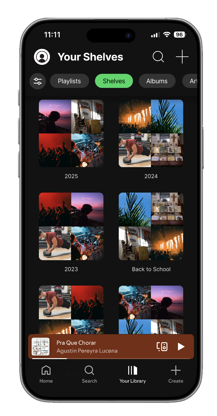
Shelves are customizable categories where users can store playlists instead of individual songs. The idea is that people with a lot of playlists can organize them into categories that will allow them to find the type of music they want to listen to easier.
Examples:
“Gym”
“Driving”
“Chill Vibes”
“Study”
“Throwbacks”
“2017 Summer”
Shelves allow users to:
Group playlists
Rearrange categories
Add custom icons or colors
Reduce scrolling
Personalize their library
Why Shelves?
Because Spotify’s UI is already strong, the goal wasn’t to reinvent it—it was to extend it in a way that feels natural and solves a real problem.
Visual Design Strategy
Because Spotify’s brand is iconic, I focused on:
Maintaining their typography and spacing
Using their existing color palette
Keeping interactions familiar
Ensuring Shelves felt like a natural extension of the app
Design Goals
Seamless integration
Minimal cognitive load
Clear hierarchy
Familiar Spotify patterns
Iteration & Critique
After presenting my initial concepts, feedback highlighted:
The need for clearer visual distinction between Shelves and playlists
A more intuitive “Add to Shelf” interaction
Better spacing for collapsible sections
I refined:
Shelf card design
Iconography
Interaction flow
Empty state screens
Final Design
Role: UX/UI Designer
Timeline: 4 weeks
Tools: Figma, Adobe Photoshop, User Research, Wireframing, Prototyping
Platform: Mobile App (iOS)
Problem Statement
Spotify users need a more intuitive way to organize their playlists so they can access their music faster, reduce scrolling, and personalize their listening experience beyond simple alphabetical or recently played sorting.
Design Challenge
Create a mobile feature that:
Integrates seamlessly into Spotify’s existing UI
Enhances playlist organization without disrupting current user flows
Feels native to Spotify’s visual language
Solves a real frustration for daily users
Balances UX clarity with UI consistency
Key Insights
Users with many playlists feel overwhelmed by long lists
Sorting options aren’t enough for people with diverse music tastes
Users want folders, groups, or categories
People often create duplicate playlists because they lose track of old ones
These insights validated the need for a new organizational system.
Information Architecture
I mapped out how Shelves would fit into Spotify’s existing structure.
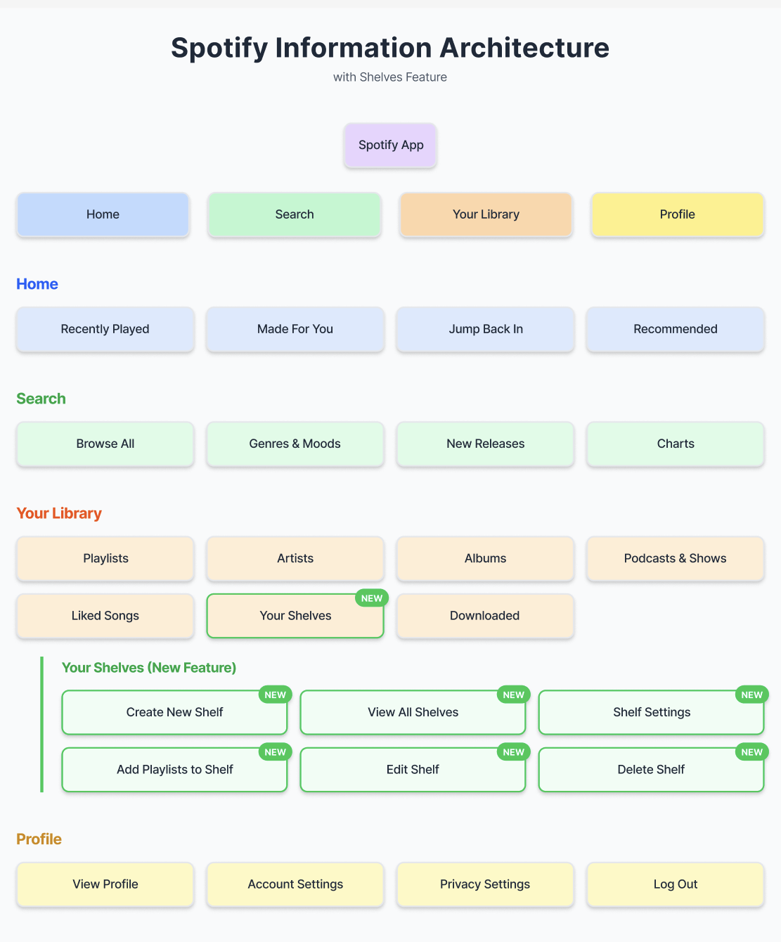
Key IA Decisions
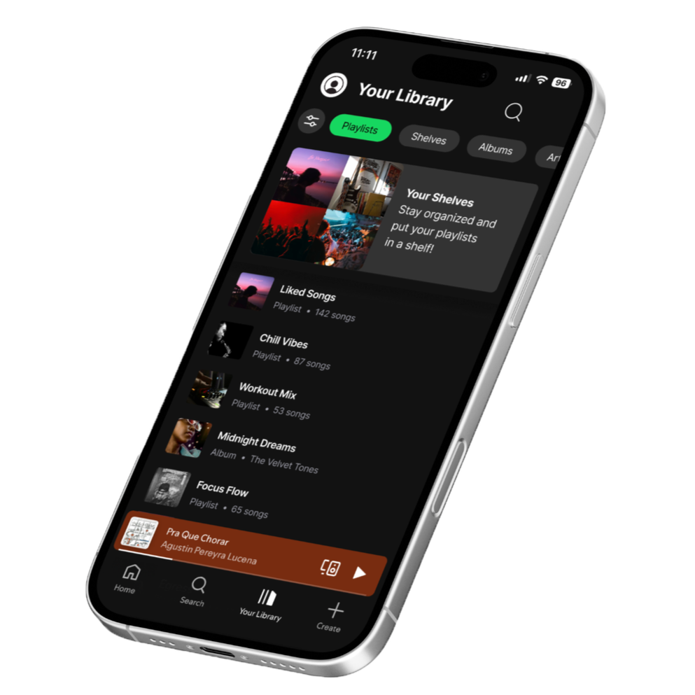
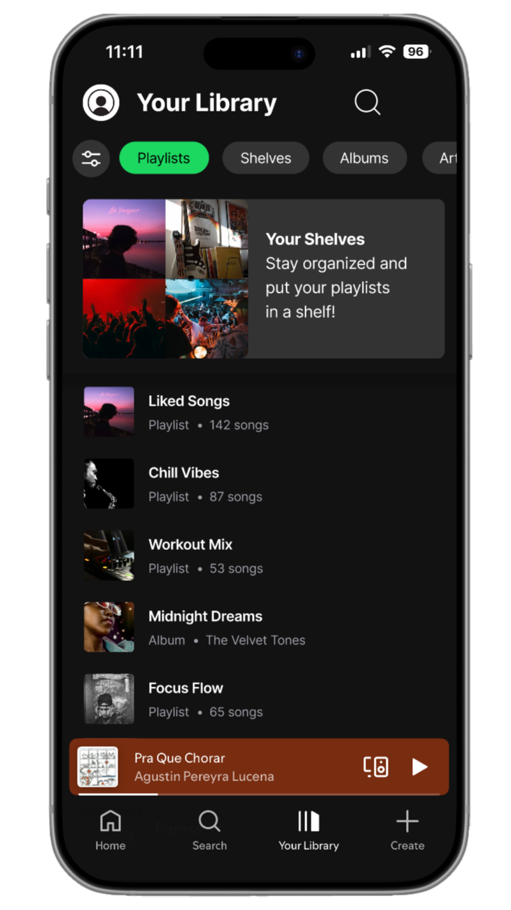
Shelves live inside the “Your Library” tab
A new “Create Shelf” button appears alongside “Create Playlist”
Playlists can be added to Shelves through long‑press or playlist settings
Shelves appear as collapsible sections
The final prototype introduces Shelves as a clean, intuitive organizational layer within Spotify’s library.
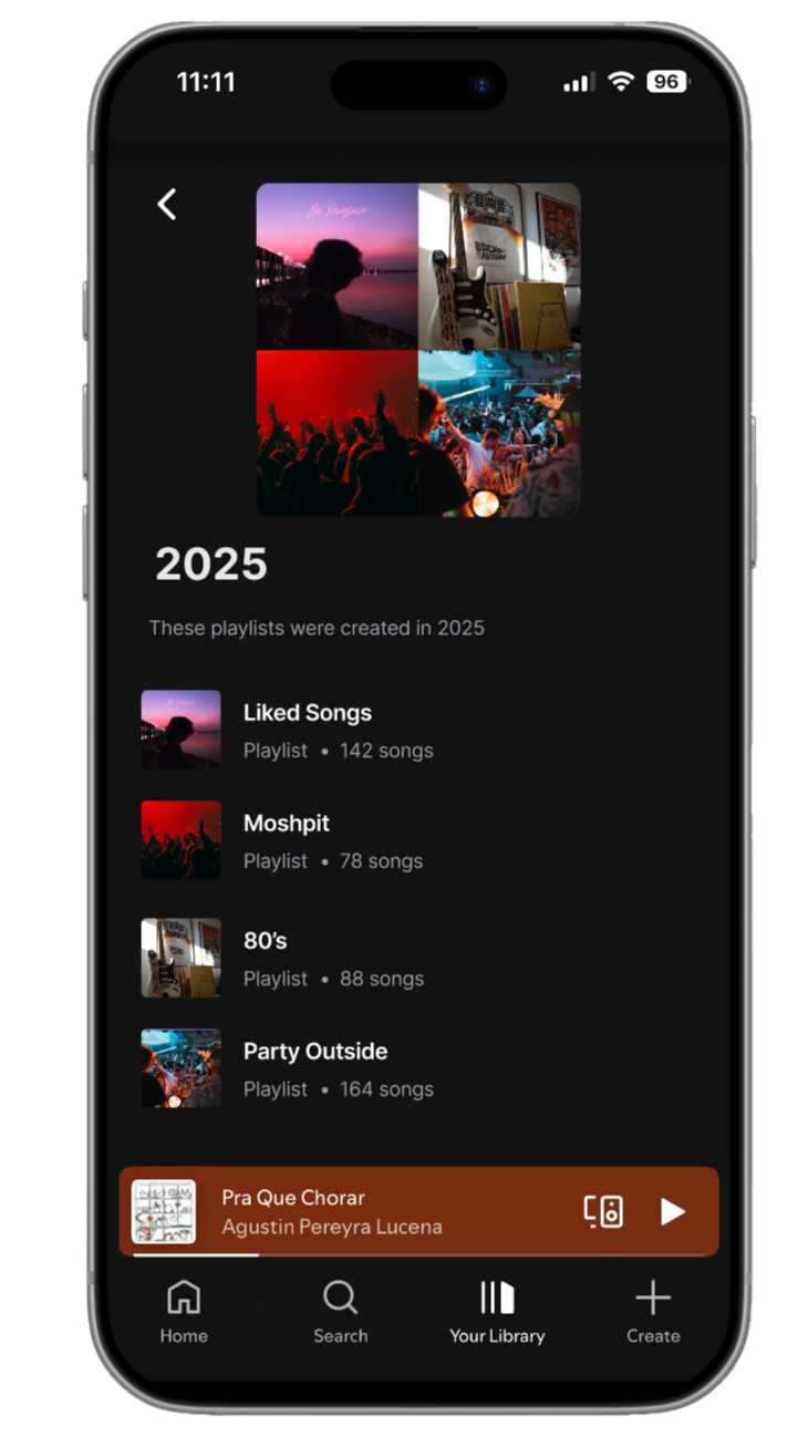
Inside a Shelf
Impact
Shelves reduce scrolling, improve organization, and give users more control over their music experience—without disrupting Spotify’s existing design language.
Future Development
If developed further I would add:
Shelf Icons & Colors — Allowing users to personalize Shelves visually for faster recognition.
Smart Shelves — Automatically grouping playlists based on mood, genre, or listening habits.
Shared Shelves — Collaborative categories for friend groups or shared music tastes.
Shelf Analytics — Showing which Shelves users listen to most.
Cross‑Platform Sync — Ensuring Shelves appear on desktop, tablet, and web versions of Spotify.
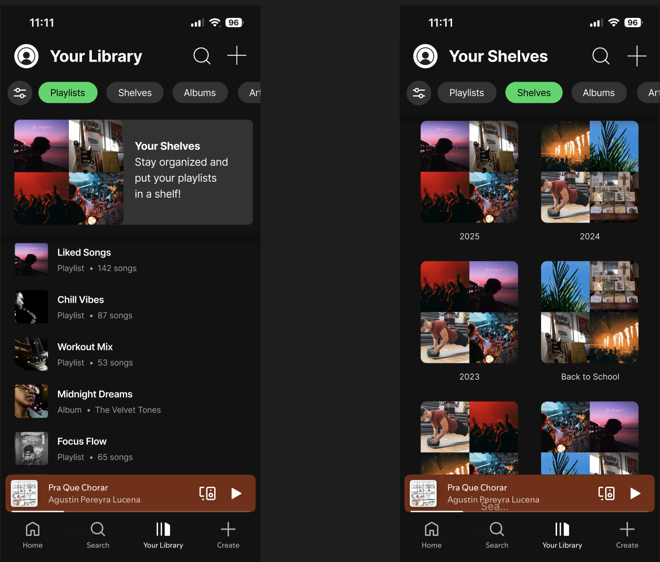
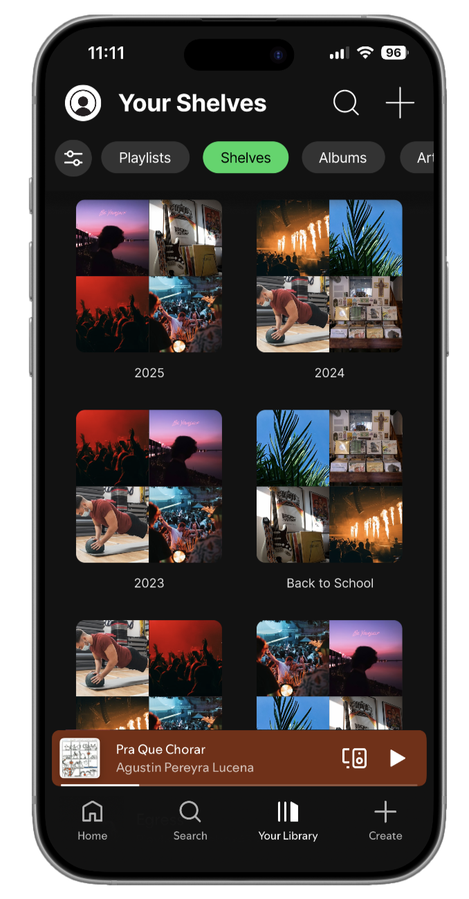
New Library Page
Key Features
Create Shelf button in the Library
Customizable Shelf names
Drag‑and‑drop playlist organization
Collapsible Shelf sections
Playlist settings updated with “Add to Shelf”
Smooth animations for expanding/collapsing
Retrospective
This project highlighted the importance of designing with an existing system rather than against it. Working on Spotify Shelves reinforced:
Respecting established design systems — Spotify’s UI is already strong; the challenge was enhancing it without breaking it.
Solving real user frustrations — Organization was a genuine pain point validated through research.
Balancing UX clarity with UI consistency — Shelves needed to feel new but also unmistakably “Spotify.”
Iterating through critique — Feedback helped refine hierarchy, spacing, and interaction patterns.
Overall, this project strengthened my ability to analyze existing interfaces, identify meaningful opportunities for improvement, and design features that integrate seamlessly into established ecosystems. It deepened my understanding of how small UX enhancements can significantly improve daily user experiences.
Shelf Page
User Flow
User taps “Create Shelf”
Names the Shelf
Selects playlists to add
Shelf appears in Library
User can expand/collapse or reorder Shelves