
A Smart Reusable Cup
MUGO
Mugo is a 7‑week responsive web design project centered around creating an original product and building a complete digital ecosystem around it. The concept introduces a reusable cup embedded with an RFID chip that allows users to tap and pay at participating cafés. The cup connects to a responsive website where users can track refills, monitor spending, and earn rewards across multiple coffee chains.
Role: UX/UI Designer
Timeline: 7 weeks
Tools: Figma, Adobe Illustrator
Platform: Responsive Website (Desktop, Tablet, Mobile)
The Problem
Understanding the Daily Coffee Experience
Coffee drinkers visit cafés constantly, but the experience is fragmented. Payments require phones or wallets, loyalty programs vary by store, and reusable cups, while sustainable, often add friction instead of convenience.
Design Challenge
Create a new, original product that:
Streamlines café checkout
Encourages sustainable habits
Works across multiple coffee chains
Integrates with a responsive website that supports the full user journey
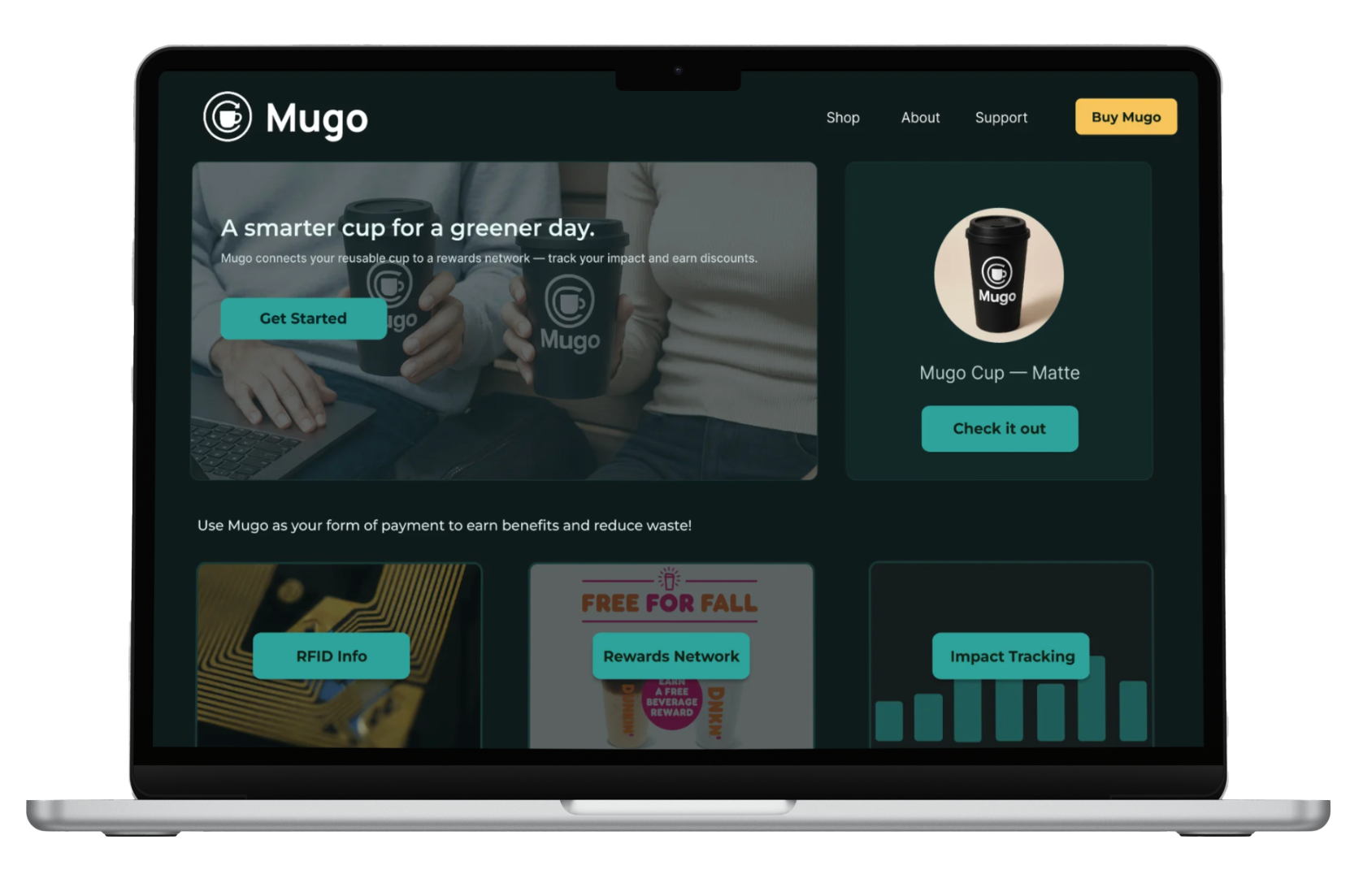
Home page
Payment page
Wireframing
The core pages for the website, include:
Home
How It Works
Rewards
Shop
Account Dashboard
Support
Low‑fidelity wireframes established the structure for desktop first, followed by tablet and mobile breakpoints. User flows focused on:
Purchasing a Mugo cup
Registering a cup
Tracking refills
Redeeming rewards
Naming & Branding
The name Mugo blends “mug” with a sense of movement and convenience. Highlighting the “GO” is important for the brand, mug and go, even with the logo I took inspiration from that idea, the mug and arrow is meant to vaguely represent a G with and O around it.
Brand goals included sustainability, friendliness, and a modern café‑culture feel.
Design System
I built a component library including:
Buttons
Navigation bars
Cards
Reward badges
Refill trackers
This ensured consistency across all breakpoints.
Responsive Design
The website was designed for:
Desktop (1440px)
Tablet (768px)
Mobile (375px)
Each breakpoint was adapted to maintain usability and brand consistency.
Final Designs
Problem Statement
Coffee drinkers need a way to simplify their café routine while reducing waste and earning rewards consistently across locations.
Research revealed that users often:
Forget loyalty cards or apps
Want a faster checkout experience
Prefer sustainable options that don’t add inconvenience
Want rewards that work across multiple cafés
Discovery & Research
I began by exploring user habits around coffee purchases, reusable cups, and loyalty programs.
Key insights included:
Users want faster checkout
They enjoy rewards but dislike managing multiple systems
They want sustainability without extra steps
Logo Design
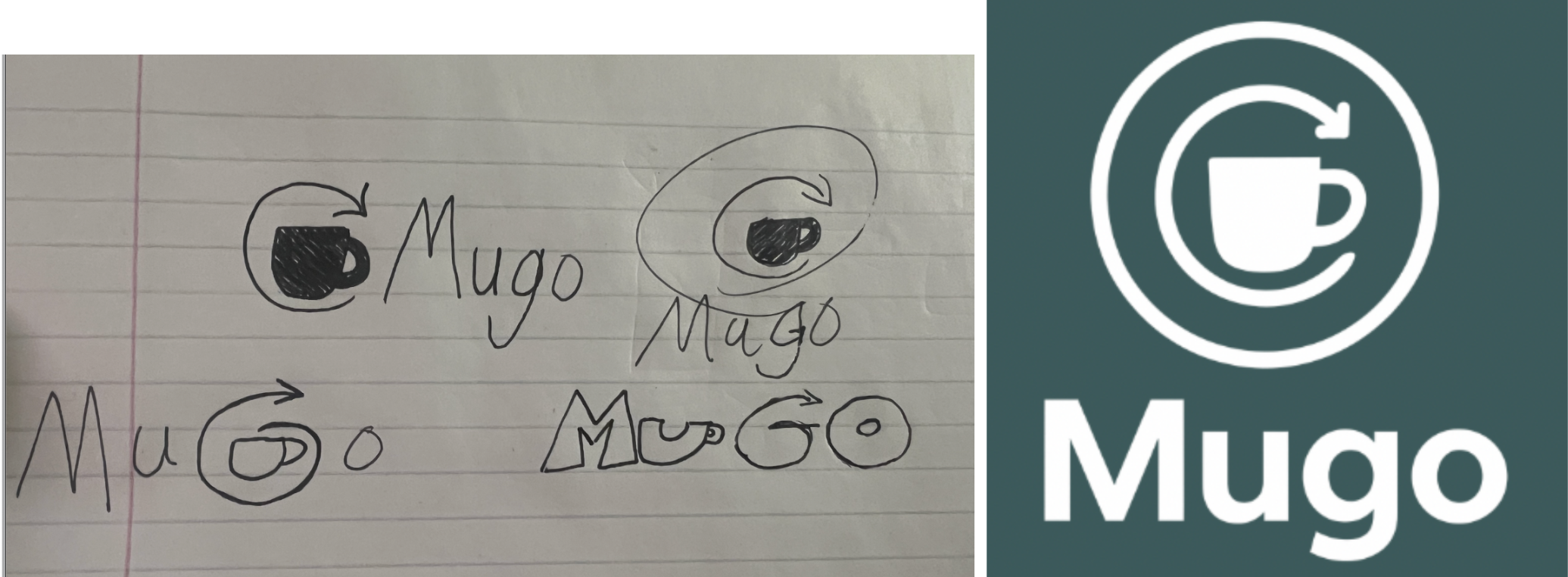
A few of my final sketches I found good enough to develop through Adobe Illustrator.
Visual Design & Branding System
Color Palette
I went with a dark greenish-blue and teal color palette through all of the designs for the app, website, and tablet. The only thing that the website version has that the others don’t is yellow used on buttons for better navigation. I felt it invoked a calm feeling and it was reminiscent of certain competitors which could possibly hint to users what this product is for.
Typography
Clean, approachable typefaces that feel at home in both a coffee shop environment and a digital interface. I used Sora and Inter from figma for type, Sora used for most headings at the top of pages. While Inter was used for most body paragraphs or small words in buttons and around graphics.
Prototyping & Testing
I built interactive prototypes for all three device sizes, demonstrating:
Tap‑to‑pay explanation
Refill tracking
Rewards redemption
Account management
User testing was required to find possible issues or things that other users might find hard to use.
Testing Insights
Usability testing with peers revealed opportunities to:
Simplify the rewards page
Improve clarity around how the RFID chip works
Strengthen the hierarchy on the dashboard
These insights guided the final refinements.
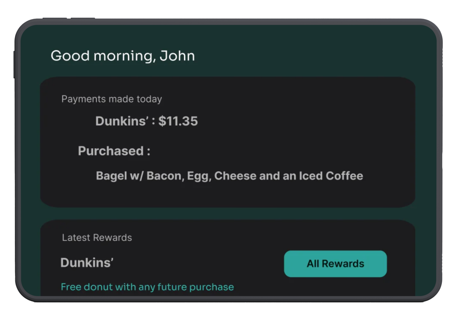
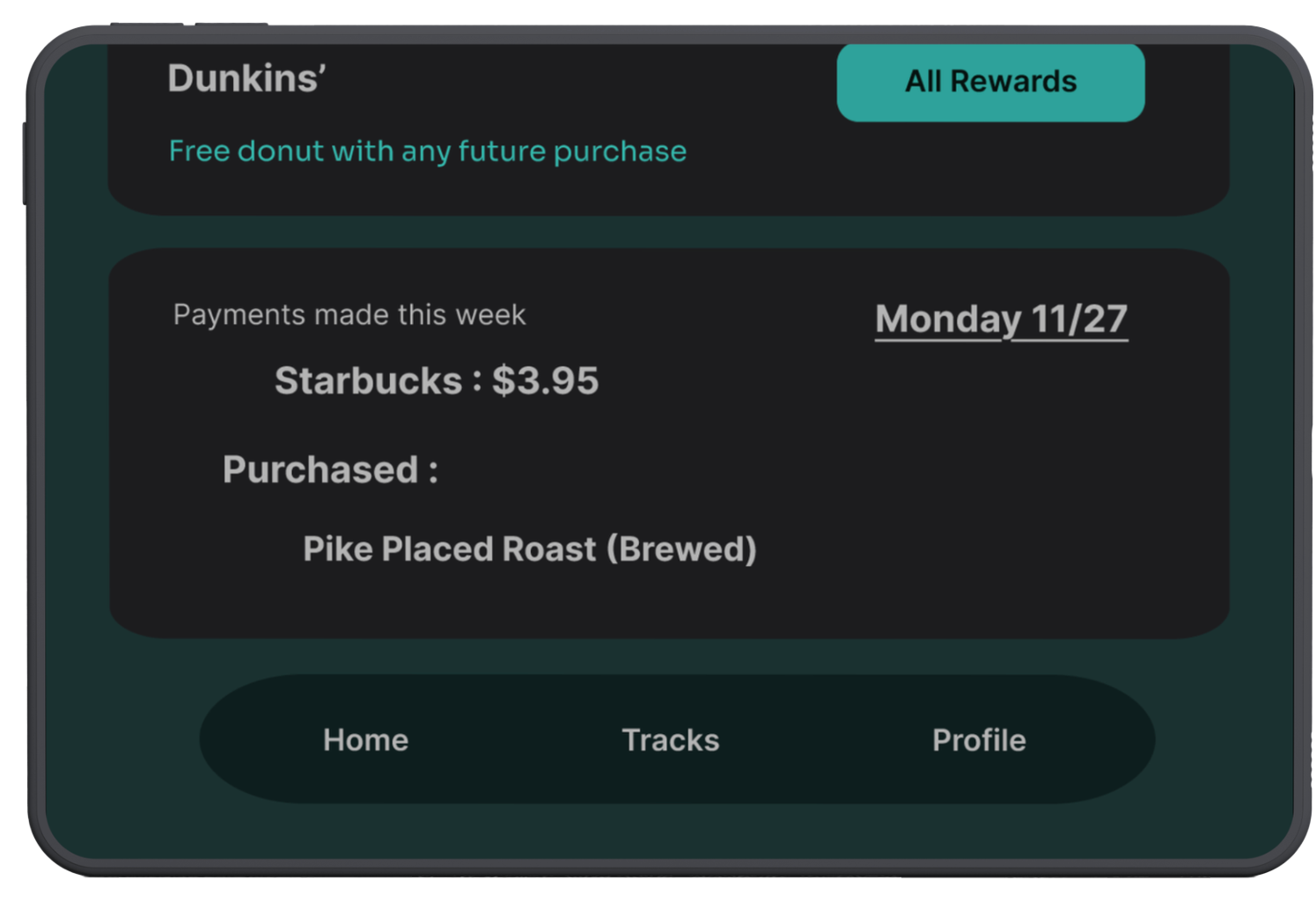
Tablet
Similar to the App design but instead there is a section for payments made throughout the week included.
Rewards Dashboard
Users can view:
Redeemable rewards
Money spent
Reward progress
Partner cafés
Account Dashboard
A personalized hub for:
Payment methods
Cup registration
Spending history
Refill logs
Future Development
If developed further I would add:
Expanded Café Partnerships — Growing Mugo’s network by partnering with major coffee chains to make the tap‑to‑pay experience universal and increase the value of the rewards ecosystem.
NFC Compatibility — Adding NFC support to complement RFID, ensuring the cup works with a wider range of payment terminals and modern checkout systems.
Mobile App Integration — Introducing a dedicated mobile app to pair with the website, allowing users to track refills, rewards, and spending on the go.
Refill Reminders — Implementing smart reminders based on user habits, encouraging consistent cup usage and helping users get the most out of their rewards.
Limited‑Edition Cup Designs — Offering seasonal or collaboration‑based cup designs to increase user engagement and create a collectible aspect to the product.
Carbon‑Savings Tracking — Visualizing the environmental impact of using Mugo by showing waste reduced, cups saved, and carbon emissions avoided over time.
Website
Introduces the Mugo cup with clear value propositions and options for the user to learn about how the tap‑to‑pay works. The rewards network that displays all businesses that Mugo users can get rewards from. Impact tracking section and a direct link to the place users can buy their Mugo cups from. As well as a support button, and about section.
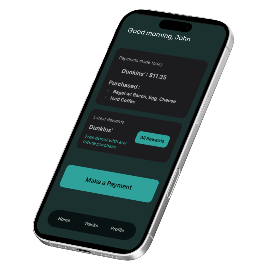
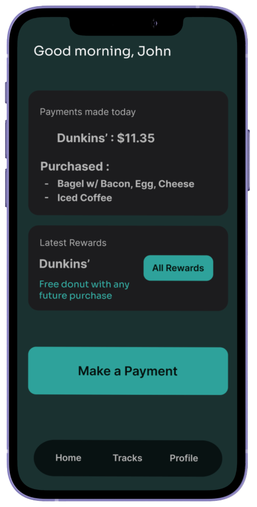
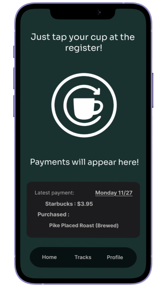
App
A display for users to see how much they spent on their most recent purchase. As well as a spot where they can see if they earned rewards from a store. General Navigation bar at the bottom that sends you to Home, Tracks, and Profile pages. There is also a big button that can be used to make a transaction.
How It Works
A step‑by‑step guide showing:
Tap to pay
Hand off your cup
Track your refill
Earn rewards
Retrospective
This project highlighted the unique challenges and opportunities that come with designing a product ecosystem that spans both physical and digital experiences. Working on Mugo reinforced the importance of:
Designing responsively from the start — Because the website needed to function seamlessly across desktop, tablet, and mobile, I learned how essential it is to think about breakpoints early rather than treating them as an afterthought. This shaped everything from layout decisions to component structure.
Aligning branding and UX — Developing the brand identity alongside the interface made it clear how visual language and user experience influence each other. Every color, type choice, and component needed to support both the product’s personality and its usability.
Using usability testing to clarify complex concepts — Since Mugo introduces a new behavior (tap‑to‑pay with a cup), testing was crucial. Feedback helped identify where users were confused about how the RFID system worked and guided refinements that made the experience more intuitive.
Balancing sustainability messaging with tech‑forward functionality — Mugo sits at the intersection of eco‑friendly habits and modern payment technology. Finding the right balance between these themes—without overwhelming the user—was a key design challenge.
Overall, Mugo strengthened my ability to design a complete product ecosystem, from concept and branding to responsive interfaces and interactive prototypes. It also deepened my understanding of how thoughtful design can make everyday routines more seamless, sustainable, and enjoyable.