
Physical Product With a Digital Component
Aquafit
AquaFit is a connected water bottle designed for my Web Design 3 course, created as part of a collaborative group project. The assignment challenged us to design a physical product with a digital component—something that exists in the real world but meaningfully connects to a mobile device. Our solution was a smart water bottle with an integrated screen that syncs to a companion app, allowing users to monitor their daily water intake with accuracy and ease.
Role: UX/UI Designer, Product Designer
Timeline: 4 weeks
Tools: Figma, Physical Prototyping, User Research
Platform: Physical Product + Mobile App
The Problem
Understanding Our Relationship With Hydration
Many people struggle to track how much water they drink throughout the day. While hydration apps exist, they rely entirely on manual input—leaving room for error, inconsistency, and forgetfulness.
Discovery & User Research
We began by exploring how people currently track hydration and what frustrations they experience. We each took time interviewing people we know to hear their thoughts.
Document of interviews and questions asked: Interview Questions
Key questions included:
“How do you currently keep track of your water intake?”
“What would make hydration tracking easier for you?”
“Would you prefer a physical product, an app, or both?”
Users expressed a desire for:
A product that tracks water automatically
A simple, easy-to-read display
A companion app that isn’t overwhelming
Design Decisions
Problem Statement
People need a way to accurately track their daily water intake through a product that integrates seamlessly into their routine, without requiring manual logging or guesswork.
Research revealed that users often:
Underestimate or overestimate their water intake
Forget to log drinks in hydration apps
Want a more passive, automated way to stay on track
Prefer products that fit naturally into their daily habits
Competitive Analysis & Inspiration
We researched existing hydration products and discovered that no product combined a physical bottle with a built-in screen and a connected app in the way we envisioned.
Our inspiration came from: Stanley and Yeti water bottles, we modeled our product after theirs and even used a Yeti with paper on it as the screen for the demonstration.
Sketches
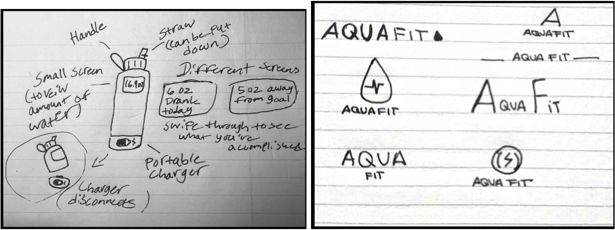
This sketch was meant to display how the water bottle would work and to give potential users a visual to help understand our vision.
These are some of our early interpretations of potential logos for the brand. Each followed the water theme with a droplet and a mall lighting bolt to represent activity and energy.
Color Choices
We selected a blue-dominant palette because it naturally evokes water, cleanliness, and refreshment. Blue also aligns with athletic and wellness-focused branding, reinforcing the product’s purpose.
Layout Choices
The layout was designed to feel energetic and sporty, appealing to athletes—our primary audience. The interface uses bold shapes, clear hierarchy, and high contrast to support quick glances during workouts or daily routines.
Typography
We chose a typeface with a sporty, active personality, which worked well across both the app interface and the AquaFit logo. It supported the brand’s identity and communicated movement and vitality.
Iteration
What Changed
The bottle’s screen was originally small and limited, displaying only basic intake numbers.
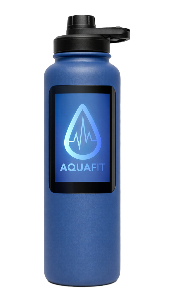
Through iteration, we expanded the screen to cover most of the bottle’s side, allowing for more information, clearer visuals, and a more premium feel.
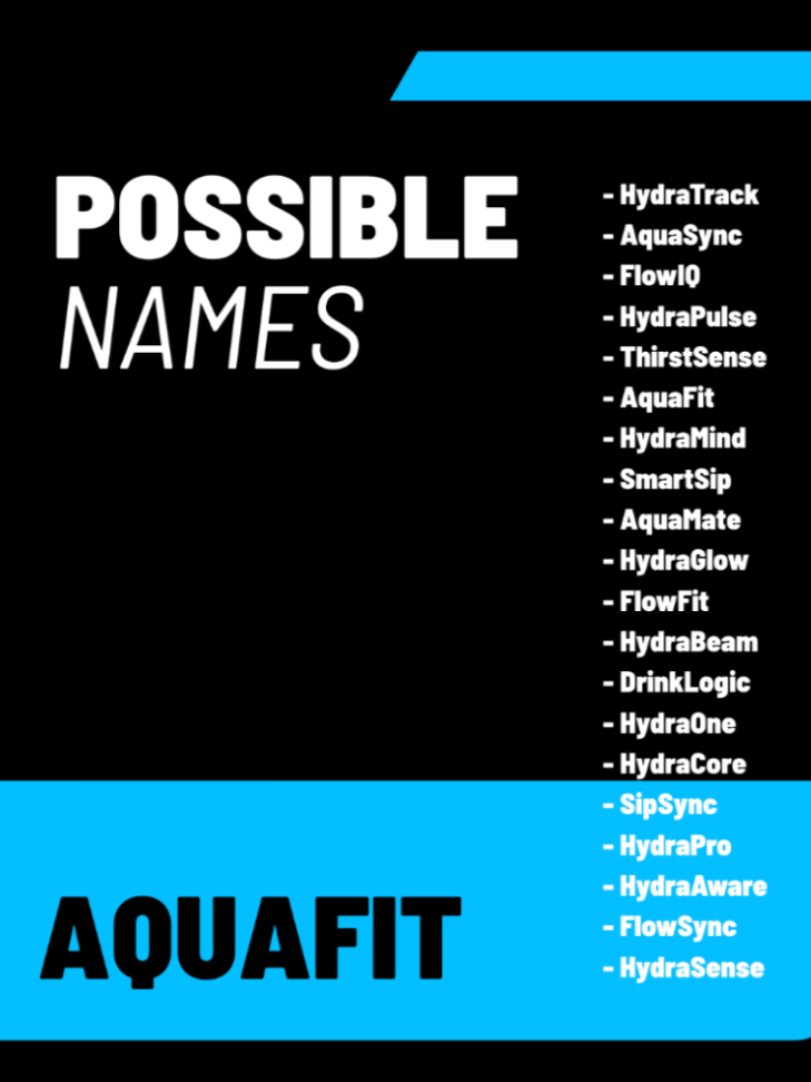
The product name evolved from AquaSync to AquaFit, and the logo shifted to a water droplet with a vital-sign zigzag to emphasize health and hydration tracking.
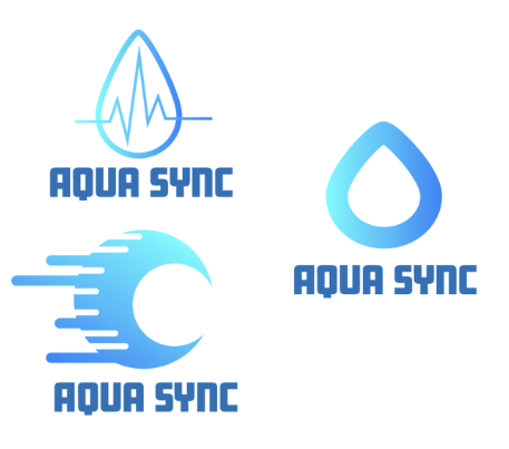
Final Logo choice
What Didn’t Work
The original small screen didn’t meet our expectations. It felt too minimal, lacked usability, and didn’t support the features we envisioned.
The early logo concepts didn’t communicate the athletic, health-focused identity strongly enough.
Feedback Received
During critique sessions—including feedback from outside viewers—users appreciated:
The ease of use of the bottle’s screen
The simplicity and clarity of the app
The intuitive connection between the physical and digital components
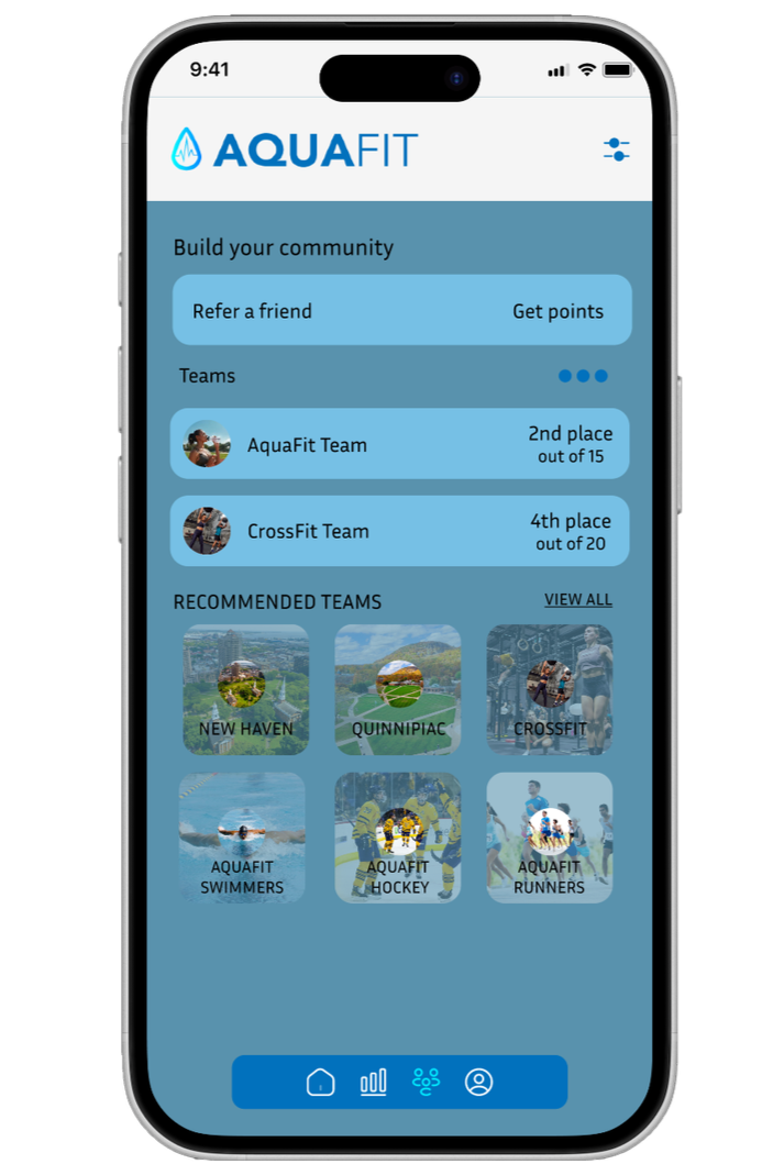
Community Page
Profile Page
AquaFit’s final app design brings hydration tracking, health insights, and community motivation together in a clean, athlete‑focused interface.
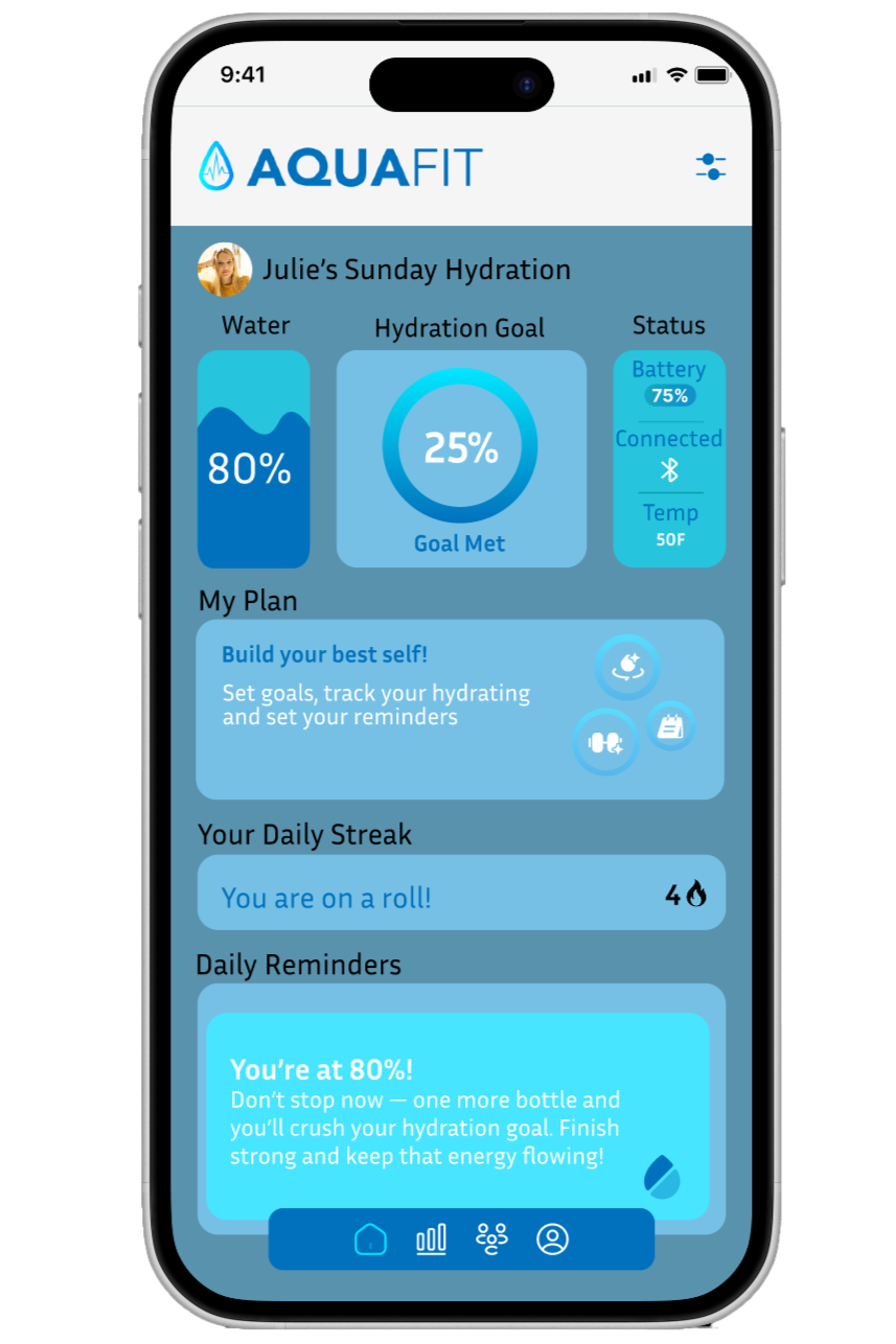
Home
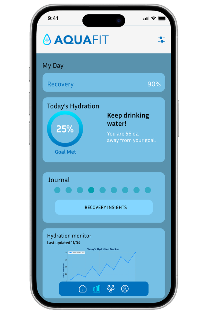
The home dashboard highlights daily hydration progress with a bold circular tracker, streak count, and quick reminders. Motivational cards reinforce consistency and make the experience feel encouraging rather than clinical.
Hydration
A simple line graph visualizes intake throughout the day, paired with a clear percentage goal. The layout is intentionally minimal so users can check progress at a glance during workouts or busy routines.
Health
The health screen expands the experience beyond water intake, showing recovery insights, hydration trends, and a personal journal. This positions AquaFit as a holistic wellness tool rather than just a tracker.
Community
Users can join teams, refer friends, and chat with others for accountability. Team cards and the messaging interface create a sense of energy and connection, making hydration feel like a shared challenge.
Recovery
A dedicated recovery view shows progress toward rest and recovery goals, along with team rankings to spark friendly competition.
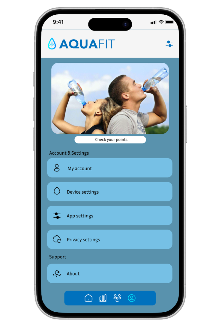
Account
The account section organizes membership, payment, device settings, and privacy options in a clean, structured layout. The design keeps navigation simple and predictable.
Brand Components
Reusable components—like motivational banners, task trackers, and hydration summaries—create consistency across the app and reinforce AquaFit’s sporty, energetic identity.
Key Features
Accurate hydration tracking through the bottle’s built-in sensors
Large, easy-to-read side screen
Companion mobile app for daily, weekly, and monthly insights
Sporty, energetic visual identity
Simple, intuitive user flow
Retrospective
This project highlighted the unique challenges and opportunities that come with designing a product that bridges the physical and digital worlds. Working on AquaFit reinforced the importance of:
Iterating early and often — Our initial small‑screen concept looked good on paper but failed in practice. Prototyping quickly revealed its limitations and guided us toward a more functional, user‑friendly solution.
Balancing aesthetics with usability — The sporty visual identity helped define the brand, but it was equally important to ensure the interface remained simple and intuitive for users who might check it mid‑workout.
Listening to feedback — Critique sessions, especially those involving outside perspectives, were essential in validating our design decisions and identifying areas for improvement.
Designing for real‑world behavior — Users don’t want to think about hydration tracking; they want it to happen naturally. This insight shaped both the bottle’s functionality and the app’s simplicity.
Final Design
Key pages
Home Page
Health Page
Water Bottle Screen
Impact & Reflection
Project Outcomes
Early user testing and critique sessions showed that users:
Found the product intuitive and easy to understand
Appreciated the clarity of the screen and app
Felt more aware of their hydration habits
Learning & Growth
This project strengthened my skills in:
Designing for both physical and digital experiences
Creating brand identity for a product ecosystem
Iterating based on user feedback
Balancing aesthetics with usability